Before responsive design,
we often had to create page layouts using
CSS Positioning properties.
Laying out a page
with those properties can be hard to learn, and difficult to use
for complex layouts, and they are generally very difficult to
make responsive. CSS Flexbox was added to the CSS specification
in 2009 and the CSS Responsive
Grid was added in 2011; both of these allow you to create
responsive web pages. When added with
media queries, you can create complex, accessible, responsive
page layouts.
Pre-Requisites
Make sure that you've worked through the previous
tutorial, Responsive Design
tutorial
before proceeding through this lesson.
A Basic Flexbox
The CSS FlexBox properties make creating simple, accessible
layouts easy. Using FlexBox, you can create a basic single-column
or single-row layout that is responsive. You can even nest
flexbox containers inside other flexbox containers, for more
interesting layout affects that are still accessible.
To use a flex box layout, follow these steps:
Define a flex container
Define the behaviour of your flex container
Determine general layout of flex items
Determine general alignment of flex items
Customize behaviour of individual flex items,
if necessary
Define a Flex Container
A flex container is the main parent or container for all of the
other elements you want to lay out. This parent/container element
must have the display property set
to flex.
main {
  display: flex;
}
The example above creates a rule that makes <main> element
a flex box.
If you'd like to create a flex box and learn as you go, you can
use this Flex Box Starter codepen:
In this Codepen example, the outer DIV will be the
flex container and the inner DIVs will be the
flex items.
If you're using the Codepen (or you can copy the contents
of the HTML and CSS tabs to your own project), go ahead and
change the .flex-box rule by adding
display: flex;. Then check to see how the layout
of your page changes.
Once you add display: flex; to the main
.flex-box container, you'll notice that all the
inner DIV elements with the green border change size and position:
previously each DIV took up the full width of the screen (which is the
default behaviour for block elements) and were stacked on top of each other.
After making the outer div a flex box, the DIVs resize to fit their contents,
and they are laid out horizontally. Depending on your screen width, they
may overflow the outer div container.
By default, a flex box lays out all its flex items
in a non-wrapping row: all items will be placed
horizontally next to each other, and if there are more
items than the flex container will fit, they will overflow
the container. In the next few sections we'll see how
to change how change our flexbox to a column layout,
and also how to tell flex items to wrap to the next row/column
instead of overflowing the container.
Customizing Flexbox Layout
Once you add display: flex;
to your container rule, you can define other CSS
properties that affect the behaviour of your flex container.
For example, you can change the direction of your layout to
be horizontal (row, which as you saw is the default) or
vertical (column) You can also define how you want items
in your flex container to wrap when the container is not wide
or tall enough.
Layout: flex-direction
The flex-direction property defines how
you wish to lay out the items inside your flex container.
You can give it one of the following values:
row (default) - lay out container items
in a row, where items flow from left to right
column - lay out container items in a
column, where items flow from top to bottom
row-reverse - lay out container items in
a row, where items flow from right to left
column-reverse - lay out container items in a column,
where items flow from bottom to top
Try the other values also: see how row-reverse
and column-reverse work. Notice also that with
some options, the alignment of items might also change!
Wrapping Items: flex-wrap
The flex-wrap property defines
whether or not the items in the container should wrap to,
the next row/column, how they should wrap.
You can use the following values:
nowrap (default) - items will not wrap
wrap - items will wrap if the container
gets too small
wrap-reverse - items will wrap if the
container gets to small, but in the opposite direction
as the "wrap" value (for example, if flex-direction
is set to row, wrap-reverse causes the items to wrap from
the bottom, across the row, and then the next row will go
above the first)
Try this in the earlier CodePen example: set the following
properties on your flex container:
Make sure you resize your viewport so you can see the effects
of wrapping.
Here's a CodePen that demonstrates a version of the earlier CodePen
but with columns (I achieved this by setting the height of the
outer DIV to half the viewport height).
The flex-flow property is actually a
shorthand property for the combination
of flex-direction and flex-wrap.
Specify a direction property value first,
then a wrap property value. For example, to set
flex-direction to column and flex-wrap to "wrap":
flex-flow: column wrap;
Try it out with the following CodePen. I left you some instructions
and suggestions, along with some things to try.
You might have noticed after playing with the previous
CodePen example that some strange things occur when you
try certain combinations of property values. For example,
when you set the flex box container's height to a large value
such as 1000 pixels while the flex box is a wrapping row,
you end up with a large amount of space between the wrapped
rows. You can customize this behaviour by setting various
alignment properties.
There are three general things you can align in a flex box:
Alignment of flex items within the main (inline) axis
Alignment of flex items within the cross (block) axis
Alignment of the flex line(s)
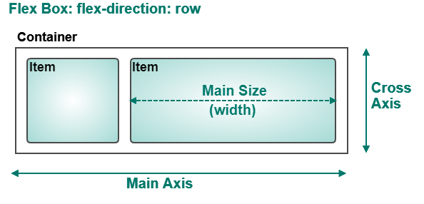
The main axis or inline
axis refers to the axis that the flex lines
are on. For row layouts, your main axis would be horizontal.
For column layouts, your main axis would be vertical.
The cross axis or
block axis refers to the axis that isn't the
main axis. For row layouts, your main axis is horizontal, so your
cross axis is vertical. For column layouts, your main axis is
vertical, so your cross axis is horizontal.
Therefore, alignment on the main axis and cross axis
depends on whether you're using a row layout
or column layout for your flex container.
Additionally, when it eventually comes to sizing items,
it's important to understand the main
size: the main size is the size of the item's
dimension on the main axis. You can probably guess that
you will also occasionally refer to an item's
cross size, which is the
size of the item's dimension on the cross axis.
Row Layout: alignment within
the main axis refers to how items are collectively aligned horizontally
along the row: are they all clustered at the left end
of the row, right end of the row, or are they all centered
on the row?
Alignment of items within the cross axis refers
to how the items are aligned vertically in the row: do they sit with
their tops flush to the top of the row, centered in the row,
or with their bottoms flush to the bottom of the row?
The main size of a flex item in a row layout is the item's
width, since the flex items are aligned on the main axis
horizontally.
The main axis in a row layout flex box is horizontal.
The cross axis in a row layout is vertical.
The "main size" refers to the width of flex box items.
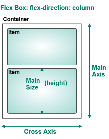
Column Layout:
Alignment within the main axis refers to the vertical
alignment of the collection of items within the column:
are all the items
clustered together at the top of the column, bottom of the
column, or are they centered vertically in the column?
Alignment within the cross
axis refers to the horizontal alignment of the collection
of items within
the column (e.g. are they clustered together at the right side
or left side of the column, or are they centered horizontally
within the column?)
The main size of a flex item in a column layout is the item's
height, since the flex items are aligned on the main axis
vertically.
The main axis in a column layout flex box is vertical.
The cross axis in a column layout is horizontal.
The "main size" refers to the height of flex box items.
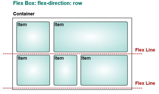
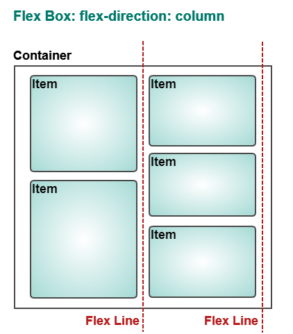
The flex line, refers to imaginary
lines that run along the main axis. For row layouts,
flex lines are like shelves that the items sit on.
Alignment of these flex lines define where the "shelves" sit on
the page: should the flex lines appear at the top of the page
or at the bottom, or perhaps in the middle? For column layouts,
the flex lines are vertical (imagine shelves, but turn the wall
sideways). Alignment of these flex lines define where the
columns go on the page: maybe all to the left side, all to the
right side, or right down the center?
In a row layout flex box, the flex lines run
horizontally. In a column layout flex box, the flex lines run
vertically.
It may be hard to imagine these details, so we'll look at each
of the three properties and try lots of examples.
Main Axis Alignment: justify-content
When the flex container items don't use up all the space available,
on the main axis, the justify-content
property defines how those items should use up that available space.
You can use any of the following values:
flex-start (default) - items are placed at the beginning
of the main axis
flex-end - items are placed at the end of the main axis
center - items are centred along the main axis
space-between - items are laid out with space in between each
item, but not between items and the edges of the container
space-around - like space-between, but includes space between
the edges of items and the container edges
Play with the justify-content property using the CodePen below.
Make sure you try all the values for both row layout and column
layout.
The align-items property
aligns the items on the cross axis. You can assign
this property one of the following values:
stretch (default) - items are stretched to fit the container
center - items are aligned in the center of the container
flex-start - items are aligned at the top of the container
flex-end - items are aligned at the bottom of the container
baseline - items are aligned at the baseline of the container
(the baseline is the line that letters sit on - some letters extend
below the baseline, like g and y. This
StackOverflow Post's accepted answer
has an excellent demonstration and explanation of baseline vs. flex-start)
Play with the align-items property using the CodePen below.
Make sure you try all the values for both row layout and column
layout.
Where the properties justify-content and
align-items align the collections of items
in the flex container, the align-content
property defines how to align the flex
lines of the container.
A flex line is the row or line that the items inside
a flex box sit on. In a horizontal flex box, the flex line
is the imaginary horizontal line that makes up a row of items.
In a vertical flex box, the flex line is the imaginary vertical
line that makes up a column of items.
For a horizontal row flex box, think of the flex line
as the shelf that you might place some flex item ornaments
on. Flex line alignment determines how those shelves are
aligned on the wall: are the shelves up near the top
of the wall, near the middle of the wall, or close to
the bottom of the wall?
For a vertical column flex box, think of the flex lines
as a bunch of strings that you have hanging from the
ceiling that you might hang decorations on (like holiday
cards or paper ornaments). Are you going to hang a set
of strings on one side of the wall, or are you going to
cluster them all in the middle of the wall?
Don't worry if you're not getting it right away:
the examples coming up should make it very clear.
The align-content property can have the following
values:
stretch (default) - lines stretch to take up remaining space
center - lines are all packed together in the centre of the container
flex-start - lines are packed together at the top of the container
flex-end - lines are packed together at the bottom of the container
space-between - lines are placed with available space evenly
distributed
between them (but no space is added between the items and the edges of the container)
space-around - like space-between, except space is also added between
items and the edges of the container
Play with the align-content property using the CodePen below.
Make sure you try all the values for both row layout and column
layout.
This CodePen allows you to play with all three alignment
properties at once. This one is better if you open it in
its own window and lay out the code windows
on the side.
The individual items inside your flex box are called
flex items. All the flex box properties you've learned
so far define the defaults for all flex items: the default
alignment, default layout, etc. You can customize various
behaviours for individual items that don't follow the defaults
you've already defined. For example, you might have set the
alignment of all your grid items to be vertically centered,
but you might wish to change one or two items to be aligned
differently. This can be done by changing properties of those
individual flex items.
Default Size of Flex Items: flex-basis
The flex-basis property defines
the default main size of
a flex item before it is placed into the flex container.
Recall that by "main size" we're referring to either the
width for row layouts, or the height for column layouts.
It's possible that a flex container might be too big
or too small to fit the flex items, so the items might
grow or shrink from their original flex-basis once
they're put into the container. The value of flex-basis
can be any valid size unit or percentage,
or it can be one of several keyword values:
auto (default) - size is based on any height/width
properties that have been set for this item
content - size is based on the content
of them item (there are additional, experimental values
you can read about in the MDN entry mentioned above)
Experiment with flex-basis and answer the question
in the CodePen:
The flex-grow property defines how much
a flex item should grow (if it is allowed to
grow at all) in relation to the other items
in the container. The value of flex-grow is a number N,
which represents N times more than an item with a value of
1. The default is 0, which means the item doesn't
grow at all.
Try the demonstrations in the CodePen below, the
instructions are in the CSS tab:
In the first Demo, after you uncomment the
.flexbox div:first-child rule, you'll notice that the
"1" box takes up any space that is not taken by the rest of the boxes.
Setting flex-grow to 1 tells the flex item to grow as much
as it's allowed, because all the other items have a default flex-grow of 0.
In the second Demo, you can see that when all flex items have a
flex-grow of 1, it means they should ALL take up whatever space is
available, causing them all to have equal widths. When the "1" box
has its flex-grow set to 2, that means it has been given permission to
grow take up twice as much of the remaining space as the other flex
items are allowed to have.
Since there are 800px available, and since one item has flex-grow: 2
and the other four have flex-grow: 1, that means the available space
is divided up into 6 equal parts (2 + 1 + 1 + 1 + 1). That means each
part is 800/6 = 133.33 pixels. So the items with flex-grow: 1 get
133.3px each, and then item with flex-grow: 2 gets 2 * 133.3px
= 266.6px.
Practice the math: say you have 1000px available in a row
and you have 3 flex items with flex-grow: 1, two flex items with
flex-grow: 2, and one flex-item with flex-grow: 3, how many pixels
are allocated to each flex item?
Solution:
Number of "parts": 3 * 1 + 2 * 2 + 3 = 10
Total space is 1000px, divided into 10 parts:
1000 / 10 = 100, so 100px for each "part"
Therefore:
The flex-grow: 1 items get 100px each
The flex-grow: 2 items get 200px each
The flex-grow: 3 item gets 300px
Check:
3 + 100 + 2 * 200 + 300 = 300 + 400 + 300 = 1000
Size of Flex Items: flex-shrink
The flex-shrink property defines how much
flex items should shrink in comparison with other flex items
in the container. The property works similarly to flex-grow,
taking a numeric value representing a shrink factor,
although the default value for flex-shrink is 1,
instead of 0.
Try the demonstrations in the CodePen below, the
instructions are in the CSS tab:
In the first demo, all the flex items have a flex-shrink of 1
(all shrink equally) and the first item (the "1" box) has a
flex-shrink of 2: this makes the first item shrink more.
When you look at all the flex-shrink values, there are
6 parts: 2 + 1 + 1 + 1 + 1 = 6. Each of the five items has
a flex-basis of 200px, but 200 pixels too much to fit a
flex container that is 800px wide. We actually need 1000px of
space (200px * 5 items), a difference of 200px. To make them
all fit equally, we have to remove 200 pixels equally:
each one should have 160 pixels of space
(800px / 5). So each item should take up 40 fewer pixels.
However, one of the items has a flex-shrink of 2: this
means it has to shrink twice as much as the others.
So that means we have 6 "parts", and each "part" is
200/6 = 33.33 pixels. So items with flex-shrink: 1 shrink by
33.3 pixels, items with flex-shrink: 2 shrink by 66.66 pixels.
In the second demo, all items have a flex-shrink of 1,
except the "1" box, which is set to 0. This means all
items will shrink equally except for the first div,
which will keep it's preferred size: the flex-basis
value of 200px. This means that there is 600px available
for the other 4 flex items, so each one gets 600/4 =
150px.
Shorthand Flex Property
The flex property is a shorthand
property for flex-grow, flex-shrink, and flex-basis.
The flex property can take one, two, or three values, as follows:
Three Values:
A number (with no units) specifying flex-grow.
A number (with no units) specifying flex-shrink.
A value for flex-basis.
Example: flex: 2 0 150px; for a flex item that should grow twice
as much as items with a flex-grow of 1, should not shrink at all,
and should have a default width of 150px.
Two Values:
The first value must be a number with no units for flex-grow.
The second value must be one of the following:
A value with no units for flex-shrink.
A value for flex-basis.
Example: flex: 2 0; would be a flex-grow of 2 and a flex-shrink
of 0, using the default value of "auto" for flex-basis.
Example: flex: 2 150px; would be a flex-grow of 2 and
a flex-basis of 150px, using the default value 1 for flex-shrink.
One Value:
Must be either a unitless number representing flex-grow, OR
a value for flex-basis, OR one of the following keywords:
none - equivalent to
flex: 0 0 auto; This will cause the item to neither
grow nor shrink to fit the container, and be sized according
to any width property that was already set.
auto - equivalent to
flex: 1 1 auto; This will cause the item to
grow/shrink as needed to fit the container and it will be sized
according to any width property that was already set.
initial - equivalent to
flex: 0 1 auto; This will cause the item to shrink to fit the
container if necessary but it will not grow to take up extra space,
and it will be sized according to any width property already set.
The align-self property overrides the
align-items property of the flex container
for an individual item, allowing you to align individual flex
items differently than the rest of the items in a container.
For row layouts, this changes the vertical alignment of the item
in its row. For column layouts, this changes the horizontal alignment
of them item within its column. Possible
values for the align-self property are:
auto (default) - align
according to the parent container's align-items property, or
stretch if there is no parent container
stretch - the item is
stretched to fit the container center - the item is
centred within the container
flex-start - the item is
aligned at the top of the container
flex-end - the item is aligned
at the bottom of the container
baseline - the item is aligned
at the container's baseline