The CSS Grid allows you to lay out elements in rows
and columns without having
to fumble around with CSS positioning. A flex box allows you to make
layouts in a single row or column that wraps when needed, whereas a
CSS grid layouts can be used to create layouts that have both rows
and columns. As with a flex box, a grid can be used
to easily create responsive layouts without media queries.
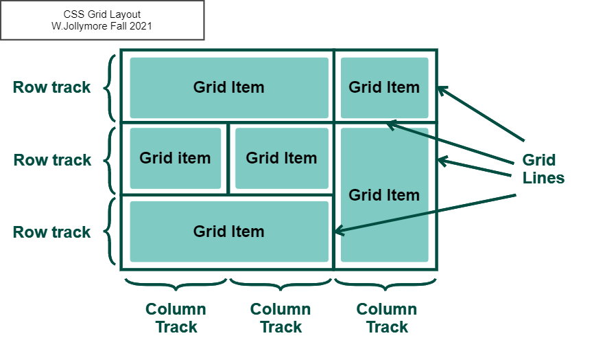
A grid is made up of rows and columns, similar to
an HTML table, although a CSS grid is done with CSS and only the
containers and items are defined with HTML. These rows and columns
are referred to as
Grid
Tracks.
Row tracks are the rows of
items, and column tracks
are the columns of items.
Grid Linesare the lines
(which may be styled to be visible lines,
or they may be invisible) between the row and column tracks in a
grid. These also include the lines on the edges.
Grid lines exist above and below each row track, and to the left
and right of each column track, so this means they also appear above the
first row, to the right of the last column, below the last row, and
to the left of the first column.
Grid Tracks are the row and columns that contain items.
Grid Lines divide grid tracks from each other; the grid border
is also made of grid lines.
Grid Lines are the lines that separate grid
tracks. There is a grid line above the top row and below the last
row, as well as between rows, so there are always #rows + 1 row lines in a grid. There is
a grid line to the left of the first column, and to the right of the
last column, as well as in between columns, so there are always
#columns + 1 column lines.
All children defined inside a grid container become grid items.
Grid items are placed into specific rows and columns of the grid.
Creating a Grid Container
The first step to coding a CSS Grid, is to first make
your Grid Container. We can do this using the
grid value of the
display property. You can make any block element
a grid container: my example below uses a <div> element but you
can use whatever block element is appropriate for your page.
div.grid-container {
  display: grid;
}
The above code will define the <div class="grid-container"></div>
as a CSS Grid container, ready to hold rows and columns
of other elements. This grid is a block-level grid, so it
will automatically include a new-line above and below
the grid. You could also create an inline-grid as follows:
div.grid-container {
  display: inline-grid;
}
Using the value inline-grid; for the
display property creates a grid container that is displayed as
an inline element as opposed to a block element.
Once you have a grid container, you can then add grid items
to it.
Adding Rows and Columns (Grid Tracks)
We use the properties grid-template-columns and
grid-template-rows
to define the row and column tracks in our grid container.
Use the grid-template-columns
property to define the number and width of columns in your grid.
The value of this property is a space-delimited list of values,
one for each column track of your grid.
The values can be any of the following:
none (default) -
columns are only created if they're needed
auto - column is sized
according to its content and container size, the items will
attempt to keep their preferred size
max-content - the size
of the column depends on the largest content item in the column
min-content - the size
of the column depends on the smallest content item in the column
any valid length measurement - sets the size of the column to that
specific length value (e.g. a value in pixels or %)
For example, to create a grid with 3 columns of their preferred
size and 1 column that is half the size of the grid width:
div.grid-container {
  display: grid;
  grid-template-columns: auto auto auto 50%;
}
In the above example, the last column will take up 50% of the
grid container, and the first 3 columns will keep their preferred
size, which may cause them to equally stretch across the remaining
50%, depending on the content of the columns.
The grid-template-rows property specifies the number
and height of each row track in the grid. It works exactly like
grid-template-columns except
it works with rows/height instead of columns/width.
This next example defines both row tracks and column tracks.
Notice I defined 3 column tracks and only 2 row tracks, even
though I have 11 grid items. The layout ends up with 4 row tracks
(the last row is missing a 3rd column)
but since I only defined the size of the first 2 rows,
the last 2 rows retain their default height.
Notice that only the first pair of rows are given the specified
height (20vh or 20% of the viewport height for the first row, and
200 pixels for the 2nd row): this is not a repeating pattern. There
is a way to repeat a row or column pattern using the repeat()
function, as you'll see in a moment.
The fr unit was introduced with the CSS Grid.
It represents a fraction or portion of space. For example, a declaration of
grid-template-columns: 1fr 2fr 1fr; means
that the column tracks are divided up into 4 portions:
the first and last columns each take up one portion,
and the middle column takes up 2 portions.
If the grid container was 1200 pixels wide, then the first and
last columns would each be 300 pixels and the middle column would
be 600 pixels.
You can combine the fr unit with other units, as you can see in this
next CodePen:
As we saw in an earlier example, it would be nice if we could just repeat a
pattern or rows and columns. This can be done using the
repeat() function.
To use the repeat() function, pass it the pattern or row/column sizes
you want to repeat. The first argument given to repeat() must be
the number of times you want to repeat the pattern. This should
be followed by a comma, and then by the pattern you want to repeat.
For example, grid-template-columns:
repeat(2, 100px 250px) will repeat
a 100px column followed by a 250px column twice; it's basically
the equivalent of grid-template-columns: 100px 250px 100px
250px; You could also say something like
grid-template-rows: 10% repeat(2, 1fr 2fr);
to have a row that is 10% of the container width,
followed by 4 rows that alternate 1fr and 2fr.
The equivalent would be 10% 1fr 2fr 1fr 2fr.
In the above example I used grid-template-columns: 25vw repeat(2, 1fr
2fr) to set the column widths to 25% of the viewport width for the
first column, then 4 more columns that are 1fr, 2fr, 1fr, and 2fr.
For the rows, I used grid-template-rows: repeat(4, 100px 150px)
to define 4 sets of two rows that are in a repeating pattern of
100px / 150px (so there would be 8 rows in total). Notice that since
I only have enough grid items for 3 rows, there is a considerable amount of
whitespace inside the grid: this is the space that would be occupied by the
other 5 rows. Notice that if you change the rows to something such as
grid-template-rows: repeat(4, 35% 60%), the height of the
grid container changes: the percentage values 35% and 60% refer to the
height of the grid container. It varies slightly from browser to browser,
but generally the height of a container is computed after the items have
been added to it. Since we only have 3 rows, the height of the grid container
is computed for only those three rows; the other 5 rows have nothing in
them, so they are counted as a height of 0.
So 35% and 60% refer to a percentage of the computed container height with
only three rows in it, not 8 rows.
Implicit Grid vs. Explicit Grid
Some rows and columns in your grid are the ones you've actually defined,
but if you have more grid items than you have defined rows and columns, the
browser will simply add rows/columns to fit those extra items. For example,
in the
Grid: Rows and Columns CodePen from earlier, we explicitly defined a grid
with 3 columns and 2 rows, but we had 11 grid items, so there were an extra
5 grid items. These 5 grid items were added into 2 extra rows, using up 3
columns in the first extra row and 2 columns in the last extra row.
The rows/columns
you've actually defined using grid-template-columns and grid-template-rows
are referred to as the explicit grid.
The rows and columns that are added to your grid by the browser are referred to
as the implicit grid. Implicit grid rows and columns are always
sized to their default sizes, and are not affected by any sizes you define
in your explicit grid via grid-template-columns and grid-template-rows.
In that earlier CodePen example, the explicit grid is the 3-column,
2-row grid we defined. The implicit grid consists of the 5
cells in the last 2 rows that were added to fit the extra grid items.
You can define the default height of implicit rows and the
default width of implicit columns using the
grid-auto-rows and
grid-auto-columns
properties. Both properties
take a single valid measurement, which will be the size of any implicit
rows or columns. In the Codepen below, I set the height of implicit rows
to be 15% of the viewport height.
So far we've been placing items in our grid in basic rows and columns.
There are additional grid properties that allow you to place items over
multiple rows/columns (similar to the HTML table rowspan and colspan attributes),
and you can also align elements within their grid cell area.
The grid-column-start property is used
to indicate at which column line a grid item should begin, and
the grid-column-end property is used
to indicate at which column line an element should end.
Note that we're referring to column lines, not column tracks.
Recall from earlier that the first column line is to the left of
the first column track, and the last column line is to the
right of the last column track, and there are also column
lines between each column track. For example:
In the example above, an element with class="grid-item"
will span starting at column line 2 (which is to the left of the 2nd
column track, or the right of the first column track), and will end
at the 5th column line (which is to the right of the 4th column track).
This causes the item to span across column tracks 2, 3, and 4.
Spanning Rows: grid-row-start, grid-row-end
The grid-row-start property is used
to indicate at which row line a grid item should begin, and
the grid-row-end property is used
to indicate at which row line a grid item should end. Note that we're referring
to row lines, not row tracks. Recall from earlier that the first row
line is to above the first row track, and the last row line is
below the last row track, and there are also row lines between each
row track.
For example:
In the example above, an element with class="grid-item"
will span starting at row line 2 (which is below the first row
track, or above of the second row track), and will end at the
5th row line (which is to the below of the 4th row track). This
causes the item to span along row tracks 2, 3, and 4.
The grid-column and
grid-row properties are shorthand
properties you can use for spanning rows and columns.
The grid-column property is a
shortcut property for grid-column-start and grid-column-end.
The syntax is as follows: grid-column: start / end;
where "start" is the column line number the grid item should start
in, and "end" is the column line number the grid item should end
with. For example:
/* this item spans across columns 2 and 3 */
.grid-container > div {
  grid-column: 2 / 4;
}
The above is equivalent to using
grid-column-start: 2;
grid-column-end: 4;
You can use the value span
followed by an integer number to indicate
that the grid item should span across a certain number
of columns. For example:
/* this item spans across columns 2, 3, and 4 */
.grid-container > div {
  grid-column: 2 / span 3;
}
The above is equivalent to using
grid-column-start: 2;
grid-column-end: 5;
The grid-row property is a shorthand
property for grid-row-start and grid-row-end. It works just like
the grid-column property discussed earlier. For example:
/* this item spans across rows 3 and 4 */
.grid-container > div {
  grid-row: 3 / span 2;
}
The above is equivalent to using
grid-row-start: 3;
grid-row-end: 5;
CodePen: Shorthand span properties
This example is the exact same as the previous one, but
using shorthand properties to span rows and columns.
Another way you can lay out items inside a grid is using grid
template areas. The grid-template-areas property allows
you to use a series of string values to define the areas of your
layout. You can then assign a specific area to an element using the
grid-area property.
The grid-template-areas property is used on the
grid container element. You assign it a series of string values
that depict the layout you want the grid container to have. Each
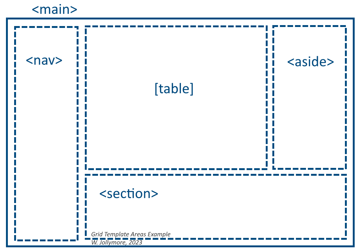
part of your layout is assigned a unique identifier. For example,
let's imagine I want to lay out a <main> element with a table
taking up most of the page, with a navigation element on the left
side and an <aside> on the right side. Below the table and the
aisde, we'd also like to have a <section> with some content.
Sketch of the main element as described
Let's decide that we want the table to take up half the width
of the screen, the navigation and the aside to each take up one
quarter of the width. We also want the table and aside to take
up a larger portion of the height than the section element does.
We might then decide to name our areas "nav", "table", "aside",
and "section". The names you choose do not have to match the elements.
I could have also called them something like "links", "info", "desc",
etc. Choose names that make sense, because it will be easier to edit
your layout later.
For this example, I might define my <main> element styling rule
as:
I purposely spaced out my code so that the set of strings
visually looks similar to the layout sketch: this is not required,
but does make it easier to read and understand. You'll see that
I assigned grid-template-areas three sets of strings. You can
separate your strings with a space or a newline with or without
tabs/spacing but you can see that the way I did it is much easier
to read and understand.
My first string "nav table table aside"
creates a row that allocates a portion of width to the navigation
element, two portions of width to the table, and one portion of width
to the aside. The second string does the same, so this gives
us two rows of content. The third string "nav section section section"
lays out one portion of the width to the nav and three portions to the
section. Since I used three strings, the height is divided up
into three portions: the navigation gets all the height, the table
and the aside each get two portions, and the section gets one portion
of the height.
Once you've assigned your grid template areas, you assign an
area name to each element that represents a grid item. In my example,
I need to tell the <nav> element it belongs to the "nav" grid area,
the <table> element that it belongs to the "table" grid area,
the <aside> that it belongs to the "aside" grid area, and the
<section> that it belongs to the "section" grid area. We do this
by assigning the appropriate name to the grid-area
property of the grid item:
The nice thing about using grid areas is that the size of the
different areas will depend on the content inside the grid items. However,
you are also able to add grid-template-columns
and grid-template-rows with grid areas if you would like
to fine-tune or have more control over the size of colums and rows.
For example, I could modify the first example with the table by
defining the preferred height of rows and columns:
Here, I'm dividing up the height into five fractional
units and giving the first two rows 2 each (total of 4)
and giving the last row 1 fractional unit. I'm
also specifying that the nav column be 150px, the
aside column be 200px, and the table columns should
take up whatever space is left. Notice that the widths
are also dependent on the width of the content in the
element, whether or not the screen width grows/shrinks, etc.
As with the Flex Box, there are several options for aligning rows,
columns, and items in your grid:
Aligning grid items horizontally within column tracks
Aligning grid items vertically within row tracks
Aligning column tracks (horizontal alignment)
Aligning row tracks (vertical alignment)
Aligning individual grid items differently than the grid default
Aligning Grid Items Horizontally: justify-items
The justify-items property allows you to
align grid items along the horizontal axis, within their column tracks.
Possible values include:
stretch (default) - the item
will stretch width-wise to fit the column track
center - the item will
be centered within the column track
auto - the item will align according
to the parent's setting, if there is one, otherwise it will behave
like the "start" value
start - the item will
be placed at the beginning of the column (usually the left side)
end - the item will
be placed at the end of the column (usually on the right side)
Aligning Grid Items Vertically: align-items
This is the same align-items property
you learned to use with CSS Flex Box. It aligns the items vertically
within the row track. It has the same values (start, end, center,
baseline, normal, stretch (default).
This is also the same justify-content
property you used used with flex grid to align items on the horizontal axis.
For a grid, the justify-content property
aligns the column tracks horizontally.
Note that it only works if the width of the grid container
is more than the width of the actual grid of items.
The justify-content property has the same values you used before:
auto, normal, start, end, center, stretch (default), baseline,
and also space-around and space-between.
However, rather than aligning each individual column track, it aligns
all the column tracks together in the whole grid. For example,
justify-content: center; will pack all the column tracks in the
center of the grid, and justify-content: start; will pack all the
row tracks on the left side of the grid. Values like space-around
and space-between will add any used space around/between individual
columns.
Aligning Grid Tracks Vertically: align-content
The align-content uses
the same values you learned when you used it with the
flex box (center, start (default), end, baseline,
space-between, space-around, stretch). This property vertically
aligns the row tracks in your grid, if there is enough vertical
space for them to use (doesn't work if the height of the row
is not more than the height of the grid item).
As with justify-content, align-content aligns all the row
tracks together, so align-content: start; will pack all the
rows near the top of the grid and align-content: center;
will pack all the rows in the center of the grid.Values like space-around
and space-between will add any used space around/between individual
rows.
As with the Flex Box, you can use the align-self
and justify-self to align individual
grid items differently from the grid default. The align-self property
uses the same values as align-items, and justify-self has the same
values as justify-items.
The align-self
property override's the grid's
align-items property for an individual item. This means that you can
use it to vertically align an individual item in a manner that's
different from what you set for the entire container using align-items (or
override the default, if you didn't set align-items).
The values for align-self include:
auto - uses the parent's
align-items value.
center - center the item
vertically within the row.
start - align the top of
the item to the top of the container
end - align the bottom of the
item to the bottom of the container
stretch - item stretches so
that top and bottom edges are aligned with the top and bottom
of the container
The justify-self
property overrides the grid's
justify-items property for an individual item. This means that you can
use it to horizontally align an individual item in a manner that's
different from what you set for the entire container using justify-items (or
override the default, if you didn't set justify-items).
The values for justify-self include:
auto - uses the parent's
justify-items value.
center - center the item
horizontally within the column.
start - align the left side of
the item to the left side of the container
end - align the right side of the
item to the right side of the container
stretch - item stretches so
that left and right edges are aligned with the left and right
of the container
It can be difficult to remember the different alignment properties,
especially as the pertain to either Flex Box or Grid, so this
table should help:
Flex/Grid Alignment Properties
Properties
Flex Box
Grid
justify-items
n/a
items on horizontal axis within a column
align-items
cross axis
items on vertical axis within a row
justify-content
main axis
column tracks on horizontal axis
align-content
aligns flex lines (vertical for row, horizontal for col)
row tracks on vertical axis
justify-self
n/a
individual item horizontally
align-self
individual item on cross axis
individual item vertically
Row and Column Spacing
In between grid rows are row gaps, and in between
grid columns are column gaps. You can define how much space
to place between rows and columns by using one of the following
properties in your grid container:
grid-row-gap -
the amount of space between
row tracks
grid-gap - a
shorthand property that allows you
to specify both the row gap and the column gap at the same time.
If you specify 2 values, the first value is the row gap and the
second value is the column gap. e.g. grid-gap: 2px 4px; adds 2 pixels
of space between rows and 4 pixels of space between columns.
If you specify 1 value, that value defines both the row and column
gap. E.g. grid-gap: 4px; defines 4 pixels of space between rows and
columns.
Each of the grid gap properties accepts any valid size/length measurement, including
percentage. The default value for each is 0.