Note that you might want to bookmark this page to use
as a reference. You don't necessarily need to go
through it all now: you might prefer to learn more
about selectors or properties, first.
Already in the two previous lessons you probably
started learning how to use some CSS properties like
background-color, color,
border, font-weight,
margin, and a few others. We'll take
time to look at these and other properties in later
tutorials. You probably also noticed the different kinds
of values assigned to the various properties you were
exposed to. This tutorial goes over some of the more
common values and will give you some references where
you can learn more. You'll also learn more about certain
kinds of values when you learn about the properties that
use those values.
Pre-Requisites
Make sure that you've worked through the previous
tutorial, CSS Syntax
before proceeding through this lesson.
Types Summary
Many CSS properties can accept different types of data,
and some CSS properties will only accept one type of data.
This section summarizes some of the more common types
of data you'll encounter when assigning values to CSS
properties. you can find more details and additional types
of values in the
MDN CSS
Values and Units Reference.
Text Values include strings that
may or may not be enclosed inside "double quotes", CSS Identifiers,
pre-defined values, and URLs.
String values might be enclosed in "double-quotes" and they might
not be. Generally, if the string contains spaces, it will be
enclosed inside double-quotes; although with some
properties, you can still use quotes
around values that don't have spaces (this is generally done by people
who are used to coding in programming languages where "string literals"
are always in double-quotes, because it's a habit and it's familiar).
Note however, that there are some properties where putting double-quotes
around the string value is invalid! We'll talk about these kinds of
properties later in the course.
For example, the font-family property accepts the name of
a font family, which only requires quotes if the font family name contains a
space:
font-family: "Times New Roman;
/* or */
font-family: Arial, sans-serif;
/* which can also be */
font-family: "Arial", "sans-serif";
In the second example, there are two strings ("Arial", and "sans-serif")
separated by a comma-space. The comma-space is not part of the string
value; it's just a separator. In the third example, I
added the quotes. The font-family property
allows you to list preferred fonts in order of preference:
in these last 2 examples, it will use Arial, and if it
can't find Arial on the system, it will use the user's
default sans-serif font.
Some properties can only accept a pre-defined
value from a list. These lists of values
depends on the property. For example, the border-style
property can accept either dashed, dotted,
double, solid, groove,
ridge, inset, outset,
hidden, none, or any one of the
CSS-Wide values.
Example:
border-style: groove;
Some properties accept URLs for
paths or URLs to resources, such as images. URLs
are specified using the url() function.
The path/URI to the resource goes inside the brackets, with
or without single- or double-quotes. Here are some examples:
This example change's a list item's (<li>) bullet to an image,
diamond.png.
Numeric Types include integers, numbers
that might have a decimal point, dimensions and percentages.
Many properties use integers and numbers: for example,
the z-order property must be assigned a
positive or negative integer representing the item's
order in the stack of items on a page (think of the position
of a playing card in a stack or deck of cards). Higher
integers mean the item is higher up in the stack.
You'll also see integers and numbers discussed when we
talk about colour values.
Dimensions are integers or
numbers that include a unit of measurement. We'll
talk more about dimensions later.
Percentages include the percent % sign
and are used as a relative unit of measurement. Percentages
specify a measurement that is relative to something else.
For example:
width: 50%;
This declaration sets the width of the item to 50%
of it's container's width.
We'll talk more about percentages and relative units
when we discuss dimensions.
Colour values are assigned to properties
taht define the colours of things, such as the font colour
(color property), or the background colour of an
element (background-color property). We'll discuss
colour values in detail later in this tutorial.
CSS-Wide values are special,
pre-defined values that can be assigned to any
property. These are covered in the next section.
CSS-Wide Values
There are a few values that are accepted by all properties:
initial
Used to set a property back to its default value.
Using the declaration all: initial; will set
all properties back to their default values.
Used to set a property to its inherited value.
If an element is a child of another element, the child
element's properties inherit (or copy) their values from the parent
element.
You'll usually use this value when you're trying to override
a previous rule, such as in this example:
Used to reset a property back to either it's inherited
value or its initial/default value.
If the property belongs to a child element, it acts like
inherit, otherwise it acts like initial.
Dimensions
Many CSS properties accept a value with a specific unit
of measurement. For example, properties that measure
the length or size of an object take a length. Length
is a type of dimension.
A dimension is any valid number
value followed by a unit of measurement.
There are several units of measure that are permitted
with CSS dimensions, too many to get into in this course,
but here are the most common you'll use:
Absolute Units
Absolute units are not used as much in CSS as
they used to be, as they don't promote
responsive design.
Responsive web pages adjust or respond to changes
in the device screen orientation, resolution,
system font size, etc. Using absolute units sets
a fixed size for an element that doesn't change,
even when the screen is resized.
px
pixels (1/96th of an inch)
Note that for advanced CSS, it will be important
to understand the difference between
device pixels and CSS pixels.
Pixels are often used to measure height and width
of elements, or font size. Before responsive
and accessible design was considered important,
pixels were also often used to define how much
margin/padding an element add, and how thick the
element's borders were. In modern design, this has
been replaced with relative
units.
pt
points, which are often used to
measure typefaces and fonts (1/72nd of an inch)
the pt unit is used to set the
font size for printed documents and should never
be used for screens (for reference, 16px = 12pt).
There are additional units such as cm (centimetres)
and in (inches) but these are rarely used in
modern web design. For more information, see
MDN:
CSS Values and Units (opens in ref tab).
Relative Units
Relative units are the preference for modern, responsive, and accessible
web design. Relative units measure "in relation to" something of a
set or fixed size. For example, you can set the font size to be
1.5 times the size of the document's default font size, or you can
set an image to be 50% of the screen's width. Relative units allow
items to scale and adjust to changes in orientation, screen size,
screen resolution, and the user's system font settings.
em
pronounced "em"; it stands for the letter "M": in typography, the
letter M was used to identify the standard height and width
measurement for a specific font (source: W3C: The
amazing em unit and other best practices)
refers to a measure in relation to an element's font or the element's
parent's font
e.g. if the document is set to have a default
font size of 20px, you can set an element in the document to
have a font size of 1.0em (20px), .5em (10px), 1.5em (30px), etc.
although em is a measure in relation to the
font size, it is also often used to measure an element's margin,
padding, and border width
elements inherit property values from their parent
elements, therefore, be wary when using ems on
child elements: see this codepen for a demonstration
Font-Size: Cascade and EMs
rem
stans for "root em"
works just like em, except that it always refers to the
font size of the "root element"
"root element" generally refers to the <html> element
you can use the html selector to style the
root element, or you can use the :root selector
(the difference is discussed in an upcoming lesson, link TBD)
The "viewport" refers to the visible area of the browser window,
so it doesn't include the browser's borders, menu bar, title bar,
etc.
1vw = 1% of the viewport width, 1vh = 1% of the viewport height
(for example, if your screen is 1920px wide by 1080px high,
10vw = 192px and 10vh = 108px; 50vw/50vh is 50% of the viewport
width/height; 100vw/100vh can be used to set something to be
equal to the viewport width/height)
these units are often used to set the size of document sectioning
elements or other containers, such as menus, article/section elements,
divs and other containers, etc; it's also useful when you need
to set the size of an element to be the same width and/or height
of the screen
simiarly, vmin can be used instead of vw/vh to use
the smaller value of a viewport's width/height: for example, 50vmin
refers to 50% of the viewport's height or width, whichever is smaller
simiarly, vmax can be used instead of vw/vh to use
the larger value of a viewport's width/height: for example, 50vmax
refers to 50% of the viewport's height or width, whichever is larger
used to indicate a percentage of the element's parent container
size.
for example, width: 50%; means the element's width
is set to 50% of its container's width
when used with the font-size property,
it refers to a percentage of the parent element's font-size
value (e.g. font-size: 10%; is the same as
font-size: .1em;
Many CSS properties accept a colour value, such as
color (the element's text colour),
background-color (the element's background colour),
and border-color (the colour of the element's
border, if it has one). There are several ways to specify
the colour value, but here I will only talk about the most
common ones.
See MDN: CSS Values and Units - Color (opens in the ref tab)
and MDN: CSS color
type values (opens in the ref tab)
for more information.
CSS Named Colours
There are about 166 pre-defined keywords for various colour
values. You can use any of these to set a property to a
specific colour. You can see the full list in the
MDN documentation for the named
colour type.
For example, I could set the foreground and background
colors of an <aside> element like this:
aside {
  background-color: gray;
  color: navy;
}
You'll notice that named colours are in all lower-case, although
most browsers support mixed case. Regardless, the standard is
to use all lower-case for colour names.
In addition to these named colours, you can also use either
of the following values:
currentcolor
refers to the element's current color value
generally you would use this to set the value of of an element's
property that doesn't already receive a default colour
refers to full transparency (or alpha channel, if that term is
familiar to you); a transparent item is "see-through", like a
glass window (the opposite is "opaque" (sounds like oh-PAKE)
- a brick wall is opaque, you can't see through it)
If the colour you wish to use is not one of the named
colours available in CSS, you can be more specific by
using a hexadecimal value. To specify the hex colour
value, you must use the following syntax:
#RRGGBB
or
#RGB
Note that #RGB is only used when the
digits/letters for RR, GG, and BB are the same.
For example, #33FF66 is equal to #3F6.
The # (number sign or hash-tag symbol) indicates that
the value is a hexadecimal colour value. The letters
following the # sign are as follows:
RR or R
Red channel:
A hexadecimal value from 0 to FF for the amount
of red.
GG or G
Green Channel:
A hexadecimal value from 0 to FF for the amount
of green.
BB or B
Blue Channel:
A hexadecimal value from 0 to FF for the amount
of blue.
Typically you would use a colour picker or mixer to
obtain a hex colour value. I like these ones, but
there are many others available on the world wide web:
For example, the code #33FF66 is a sort of lime green:
aside {
  border-color: #33FF66;
}
Note that you could have also said:
aside {
  border-color: #3F6;
}
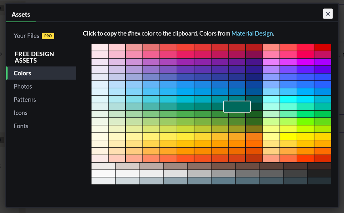
In CodePen.io, you can also use the built-in colour picker:
just click on "Assets" on the bottom-left of the screen, then
choose "Colors". You can then click on a colour chip, and the
hex code will be copied to the clipboard. Close the Assets/Color
dialog to go back to your code, where you can paste the colour
code wherever you want to use it.
The CodePen.io Colour Picker
The rgb()/rgba() Functions
Another common way to refer to a specific colour that isn't
already defined with one of the CSS named colour values is using
either the rgb() or rgba() function.
The rgb() function accepts three integer values,
each from 0 to 255, for the value of each colour channel: The first
argument is the red channel, the second value is the green channel,
and the third value is the blue channel. For example, earlier I used the
colour code #33FF66 or #3F6. The hex value
33 has an integer value of 51, the hex value FF has a value of 255, and the
hex value 66 has a value of 102. Therefore, I could have created the
same CSS by using the rgb() function as follows:
aside {
    border-color: rgb(51, 255, 102);
}
As with hex codes, you would likely use a colour picker or colour
mixer to determine the integer values to use for a specific colour.
The rgba() function adds a fourth argument for the
alpha channel. The alpha channel defines
how much transparency or opacity should be included: a value of
0 means fully transparent and a value of 1.0 means fully opaque.
Anything in between means partially transparent (e.g. .5 would be
50% transparent). Generally you would use transparency on
the colour of an element that is over top of another, otherwise the
transparency just has the appearance of making the colour less intense.
You can see an demonstration of the rgba() function in this CodePen: