Media queries are a powerful tool when it comes to
responsive web design. You
can use a media query to change the layout and styling of elements
on a page when the screen size or orienation changes, or
even when you print a document. For example, if you wanted to print
these pages, it won't include the navigation bar inside each
sub-topic, since they're not needed in a printed page. I also
change the colour scheme to make certain items easier to see
on paper. On my main pages, I even change single column layout
to a multi-column layout when the page is viewed on a wide screen.
A media query gives you more control over your page when the
user is on smaller devices. It allows you to apply
certain styles only when a set of criteria is met, such as
the width of the screen, the screen's orientation, or if the page is
being printed on a printer.
Example
Below is an example of a media query in an external CSS file.
This query defines some styling for any screen device that
has a width of 480px or higher. For a device with a screen that is
480px or higher, the element(s) with the class "flex-box"
will switch to a flexbox column layout and align flex items
on the cross axis so that they stretch their widths to
fit the column width.
Media queries start with the @media rule and are followed by
the criteria you want. These criteria include
media types
and media features.
You can write complex logical
expressions using logical operators.
Let's take a look at each in the next few sections.
Media Types
Media types allow you to define the type of media or
device that a media query should apply to. The styles defined in the
media query will only apply to that type or device.
For example, you can specify that a media query only apply
to digital screens, or only to a printed document.
The current media types are as follows:
screen
- for devices with screens of any size (you can
specify sizes and orientation by adding
media features)
print
- for formatting printed output, styles in a
print media query will be applied in print preview and
in the printed document
all
- the default if you don't specify a media type,
which refers to all types (both screen and print)
For example, a media query that starts with:
@media only print { ... }
will apply only to documents that are printed or in the
browser's print preview mode.
Media Features
Media features allow you to define styles for devices with certain
features or characteristics, such as screen size, orientation,
aspect ratio, resolution, whether or not JavaScript
is supported, and several other features.
Features generally have a value associated with them and must
be enclosed in parentheses, e.g.
(resolution: 150dpi)
There are many media features you can apply to a media
query. You can see a complete list at
MDN: @media --
Media Features
but here are a few common ones:
min-width allows you to define a criteria that
applies to screens with a width that is
greater than or equal to a specified value. For example:
@media (min-width: 480px) { ... }
This example indicates that the media query applies when the
device's width is 480 pixels or higher.
NOTE: several browsers support Media Queries
Level 4's more friendly syntax: you could use @media (width >= 480px)
instead. It's not supported in all browsers yet, so make sure you
check before using this newer syntax.
max-width allows you to define a criteria that
applies to devices with a width that is less than or equal to
a specified value. For example:
@media (max-width: 480px) { ... }
This example indicates that the media query applies when
the device's width is 480 pixels or less.
NOTE: several browsers support Media Queries
Level 4's more friendly syntax: you could use @media (width <= 480px)
instead. It's not supported in all browsers yet, so make sure you
check before using this newer syntax.
orientation allows you to define a criteria that
applies to devices with a specific orientation. For example:
@media (orientation: landscape) { ... }
This creates a media query that applies to a device in landscape
mode (when the device's width is greater than the height).
The other value you can use is portrait (when the
device's height is greater than the width).
Logical Operators
Adding logical operators to your media query criteria
allows you to join multiple criteria together. For example, you can
specify that a media query apply when viewed on a screen AND when
the screen is of a certain size, or you can apply a query when
a document is printed OR it's viewed on a monochrome device.
Valid logical operators are:
and: all criteria joined with "and" have to
be true for the query to apply
, (a comma): at least one of the criteria
has to be true for the query to apply
(note in Media Queries Level 4 you can use or
instead of the comma)
not: negates a criteria
only: the query applies only if all the query's criteria
matches (this is used to allow support for older browsers)
AND Operator
The and operator joins criteria where
all criteria must be true in order for the styles in the media query
to apply. For example:
@media print and (orientation: landscape)
means that the styling applies to documents that are
printed in landscape mode. Both criteria must be true:
the document must be printed (or in print preview) and it must
be in landscape mode.
OR Operator
The comma is the "or" operator: You can use it when you want
to list 2 or more criteria where at least one of thoes criteria
must be true. Examples:
This query will apply if the page is viewed in landscape mode or
on any media type that is 1098px or more in width.
@media print and (orientation: landscape), print and (min-width: 900px) { ... }
This query will apply styling if the
document is being printed (or print-previewed) in landscape mode,
OR the document is being printed with a width of 900px or higher.
NOT Operator
The not operator is used to negate a criteria.
This operator must be the first item
in the media query (after the only operator, see below),
and it must be followed by a specific
media type. For example:
@media not screen and (width: 1098px)
This criteria says to "apply this query only if
the screen is NOT equal to 1098 pixels". (Note I've
introduced an additional media feature: width)
When using the not operator, note that it
applies to an entire criteria.
For example:
@media not screen and (orientation: portrait)
The criteria screen and (orientation: portrait) is
true if it's a screen in portrait mode. Adding the not
operator negates this criteria, so that the query only applies if
this criteria is false. In other words, this query will NOT apply
if the device is a screen in portrait mode. However, if the
page/document is printed (media type print),
or it's a screen in landscape mode, the criteria
is true and the query will apply.
When using multiple criteria separated by commas, the not
operator only applies to the criteria in which it's used,
for example:
@media not print and (monochrome), screen and (monochrome) { ... }
In this example, the query will apply styles to a document that
is NOT printing in monochome or it's on a device that has a
monochrome screen.
ONLY Operator
The only operator is used to indicate that the entire
query must match in order to apply any styling (or in other
words, "only if you understand the whole query"). We use it
to keep older browsers from breaking the page if they
don't support media queries. The "only" operator must
be the very first word in the media query and MUST
be followed by a specific media type. Example:
@media screen and (min-width: 480px) { ... }
Without the "only" operator, an older browser will only see
the "screen" criteria in the above example and not the rest.
As a result, it will apply the styling to all screens, regardless of the
screen width. By adding only, an older browser won't apply
the styles at all because it doesn't understand the entire query.
@media only screen and (min-width: 480px) { ... }
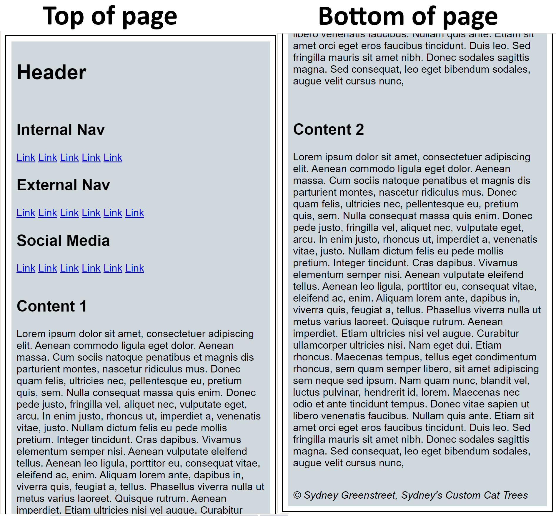
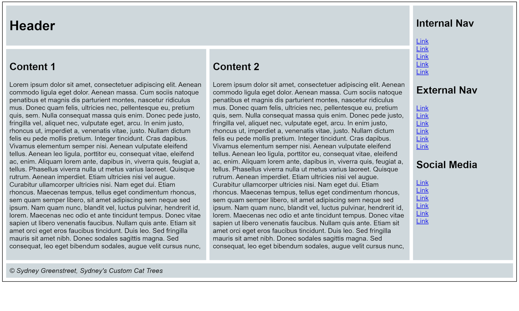
Using Media Queries
So where do you place media queries? You have 2 options:
In a separate CSS file that is applied when a media query matches.
In the same CSS file as other CSS styles, where it will only
be applied if the query matches.
Separate CSS File Example:
You might prefer keeping your styles for desktop/laptop devices
different from those for tablets and smart phones. This can come in
handy if you have a set of styles that you like to use for several
different sites, and/or you have a completely different set of
style rules for larger screens and smaller screens.
To make this work, you use a normal <link>
element for your stylesheets, and add the media query in the
media attribute:
<link rel="stylesheet" href="css/main.css">
<link rel="stylesheet" href="css/tablet.css"
    media="only screen and (min-width: 768px)">
<link rel="stylesheet" href="css/desktop.css"
    media="only screen and (min-width: 1098px)">
In the above example, the main stylesheet is main.css and will be
applied to any device that has a screen that's less than 768 pixels wide.
The second <link> references tablet.css, which will be applied on
screens that are 768 pixels or greater, unless they're 1098
pixels or greater, in which case the last stylesheet, desktop.css,
is applied.
This approach works well when you have a completely different stylesheet
for different device sizes. If you're only changing a few things like
the layout of the page or switching elements between block and inline
display, you should instead use a single CSS file with a media query
inside it.
Same CSS File Example
For minor changes to a page's styles, you can place a
media query inside the same CSS file as the rest of your styles.
The media query goes inside
the @media rule with it's own code block:
/* assumes a container on the page with
class="flex-box" to act as the flex container

by default, set flex container to a single, non-wrapping
column where items stretch to fit the width,
set minimum width for divs to be 200 pixels */
.flex-box {
  align-items: stretch;
  display: flex;
  flex-flow: column nowrap;
  justify-content: flex-start;
}

.flex-box > div {
  font-size: 1.1em;
  min-width: 200px;
}

/* for wider screens, switch to a wrapping row and
space out the elements, minimum width of divs can be a bit
wider and have larger font size */
@media screen and (min-width: 768px) {

  .flex-box {
      align-items: flex-start;
      align-content: space-between;
      flex-flow: row wrap;
  }

  .flex-box > div {
    font-size: 1.5em;
    min-width: 400px;
  }
}
In the above example, we set up a flex box
with a column layout and set the flex items
to a minimum width of 200px. When the screen
width becomes 768px or more, the main flex box container
is changed to a wrapping row layout, and flex box items
are made larger.
This approach to media queries is easier when you are changing the
layout of the main container and perhaps the behaviour and
fize of some items. When using the separate files approach discussed
earlier, you'll have to remember to change all your CSS files when
making changes that have nothing to do with responsive design.
When using this approach in a single CSS file, you don't have to edit
multiple files when changing the page's appearance.
Exercises
Copy the HTML and CSS from the following CodePen into
a project called /exercise1:
Media Query
Exercise 1 CodePen. Add a media query that
changes the layout of the page when the screen width is 1098 pixels or more,
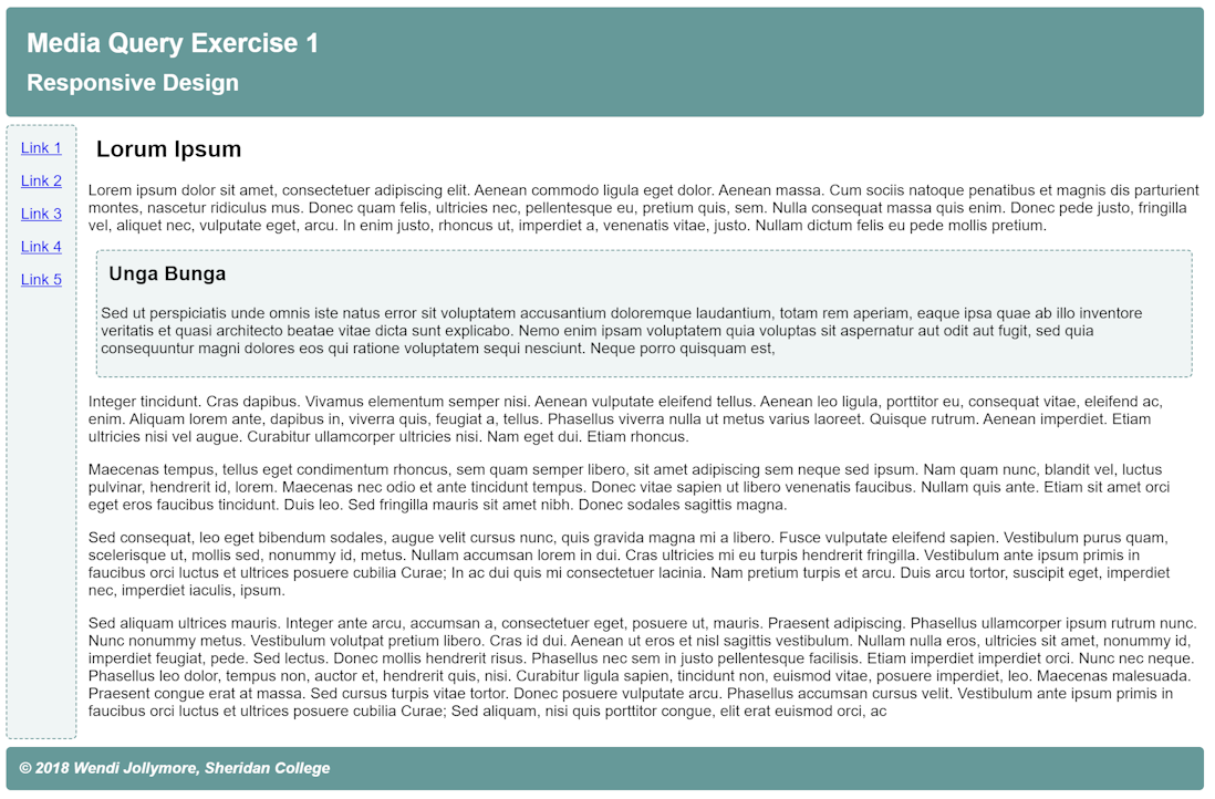
so that it looks like the image below:
Desired result for Exercise 1
Copy the code from this codepen for exercise
2 into
a project called /exercise 2. Modify the CSS by using a media query
to show the row of buttons instead of the selection list and GO button
when the page is displayed on a screen that is 768 pixels or more wide.