In this lesson you'll continue worthing with form input fields by
learning to use check boxes, radio buttons, selection lists, and
other input controls.
Pre-Requisites
Before doing this tutorial, make sure you've gone through
the Basic Forms tutorial
and that you're comfortable with the form element and its
attributes, along with basic <input> elements.
You should also have a look through
Accessible
HTML Form at the Web Standards Project.
Radio Buttons and Check Boxes
Check Boxes
A check box is used when you want to ask the user a
question that requires
a yes/no answer, or when you need to present the user with a
list of options
to choose from where more than one selection can be made. Examples:
In the first example, the user can check the box to answer "yes" and
leave it unchecked to answer "no". In the second example, the user can
select any of the boxes that apply. In fact, they could check all of the
boxes, some of the boxes, or none of the boxes.
To create a check box, use the type attribute value of "checkbox":
<label for="chkPgmg">
  <input type="checkbox" name="chkPgmg" id="chkPgmg" value="on">Do you like programming?
</label>
With check boxes, when the form data is sent to the server, the
checkbox value is only sent when the check box is checked. When
the checkbox is unchecked, no data for the checkbox is sent to the
server. The value attribute contains the value that this
field will have when the check box is checked. Usually this is just
set to "on" or "true", but you could use other values, too.
If you want a check box to be checked by default, add the attribute
checked to the tag:
<label for="chkPgmg">
  <input type="checkbox" name="chkPrmg" id="chkPgmg" value="on" checked>Do you like programming?
</label>
The above example appears as:
The checked attribute is a boolean attribute: if included, the box is
checked. If not included, the box is unchecked.
Note how important the <label> element is on controls like the check box:
it's much easier to check because you can click on the prompt
text!
Radio Buttons
Radio buttons (sometimes called option buttons by some Windows programmers)
are used when you want to present the user with a list of choices from which
only one selection is allowed. For example:
Here, the user is only allowed to pick on choice from the list. Check boxes
would not be appropriate for this input because they would allow the user
to select more than one item. You can't be in more than one age range, so
we use radio buttons.
Radio buttons have a type attribute value of "radio". You'll notice in the
example that when you select one radio button, any other selected radio button
becomes unselected. The group of buttons are treated like a single input field
with one value, so each radio button in the group is given the same name:
As with check boxes, adding checked to an option
will make that the selected option by default.
Note that every single radio button has the same name
attribute value! This is an important part of how radio
buttons work for 2 reasons:
Radio buttons act as a group: only one radio
button can be selected
at a time. See what happens when you use radio buttons with
different (or missing) name attributes:
Notice that the radio buttons don't work properly! In order for them to act
as a group, they must all have the same name.
The radio button group is a single input field. When the field
"fruit" is sent to the server, it will contain the value of the selected radio
button. For example, if Banana is selected, then the server will receive
fruit="banana".
Selection Lists
Lists are fields that contains a set of items the user can select from.
Some lists are large enough to show a number of the items in the list,
and these are what people often refer to when they talk about a List control.
Some lists show only one item, and the user must open the list control in
order to see the rest of the items. These are often referred to as
"drop-down lists". Some call them "combo boxes", but a real combo box
allows the user to add items to the list by typing them into the control,
which is not what we're talking about here. Examples:
These two controls show the same data, but the first
one is a "drop-down" style of list.
To create a list control, you use the <select></select> tags.
If you want a drop-down list, that's all you need, but if you want
the larger
list, use the size attribute set to the number of rows you want. For
example, the two select tags for the two examples above are:
The value attribute of the option tag sets the value that will be returned
to the server for this field when an item is selected. For example, if the user selects
the "Java" item in the list, the field "languages" will have a value of "J"
when the form is processed.
To have a default item selected, use the selected attribute in
the option you want selected:
If you have a long list, you can group items using the <optgroup></optgroup>
tags. The optgroup tag's label attribute defines the text to use in this option
group. For example:
There are many situations in which you might want
a user to be able to select multiple items. For
example, you might want the user to choose multiple
animals in the list box examples above. To allow this,
you include the boolean multiple
attribute.
In order for a server-side program to process multiple
values, you need to make sure your element's name attribute
value is written with array syntax (adding square brackets):
The text area is a multi-line text field that allows the user to type multiple
lines of input. It doesn't use the regular input tag,
but instead uses a set of <textarea></textarea> tags. The textarea
tag has the following attributes:
rows="n"
The number of rows the text area should display.
cols="n"
The width of the text area in characters (like
the size attribute for text boxes).
Try typing text in the box. It will wrap automatically. In addition, if you
add more than 5 lines of text, the vertical scrollbar will automatically become enabled.
If you want something to appear automatically in the text area, you would type
it between the opening and closing tags:
<textarea name="txtComments" rows="5" cols="35">...default text
for text area goes here...</textarea>
The box below has text between the textarea tags:
HTML5 added several new input types; these types allow you to validate
certian kinds of values, such as numbers, URLs, and email addresses.
Numeric Fields (Spinners)
A Spinner is a control that allows the user to select a numeric value
by incrementing or decrementing. This is implemented in HTML5
using the type="number" input field.
In addition to type="number", you also need the following
attributes:
min="n" - the minimum number allowed in the field
max="n" - the maximum number allowed in the field
step="i" - the increment value (how much to add/subtract
when the user manipulates the control); the default is 1 so if
you want to step by 1, just leave this out
<input type="number" min="5" max="10" value="5">
Try it out: you can enter a value by hand or you can increment/decrement
from the default value provided. Note that this may appear differently
in different browsers - in some browsers you don't see the increment/decrement
arrows until you hover over the control or put your insertion point
inside the field.
In this example, the user is only able to enter 5, 6, 7, 8, 9, or 10.
Try manually entering other values and submitting.
Below is a CodePen with another example that you
can play with. In this example I also added additional
HTML Validation
Attributes in case you are interested.
The email field looks for a valid email address, although each
browser has a different definition of what that is. In Chrome, you
just need something@something, but in Opera, just an simple @ symbol
will suffice. Similarly, URL usually only requires http:// or https://
but some browsers only require some text followed by a colon.
If you want to add stricter validation, you would need to add the
pattern attribute.
Accessible Forms
There are a number of extra things you can add to your markup to improve and
enhance your form interface. For example, you can change the tab order, add
field labels, and put borders around groups of elements using fieldset and
legend tags.
Using the autocomplete Attribute
WCAG Technique H98 shows you how
to link an
input field to a specific input value saved by a user's browser.
Many modern browsers save user's personal information (name, address,
etc) so that fields can easily be automatically filled. This
assists users with cognitive or motor disabilities by decreasing
the amount of effort required to fill in forms.
When you add the autocomplete attribute to a
form field, it tells the user's browser that it's ok to fill
this field with an piece of data, and which piece of data it
should fill the field with. The autocomplete attribute
should be assigned one of a specific set of values, such as:
off turns off autocomplete, so the browser
will not be allowed to fill in this field
on turns on autocomplete but lets the browser
decide what piece of data to enter
name tells the browser to enter the user's full name
(first name and last name)
given-name tells the browser to enter the user's
given name or first name
additional-name tells the browser to enter the user's
middle name
family-name tells the browser to enter the user's
family name or last name
honorific-prefix tells the browser to enter the
user's title e.g. Mr., Ms., Dr., etc.
honorific-suffix tells the browser to enter the
user's suffix e.g. PhD, III ("the third"), Jr., etc.
address-line1, address-line2,
address-line3 tells the browser to enter the various
lines of a user's street address
postal-code tells the browser to enter the user's
postal code (or zip code for US addresses)
country-name tells the browser to enter the user's
country
email tells the browser to enter the user's
email address
username tells the browser to enter the user's
username for a particular site
current-password tells the browser to enter the user's
password for a particular site
See the documentation for more values you can assign to the
autocomplete attribute: you can also autocomplete
birth date data, telephone number, stored credit card
data, and many other pieces of data.
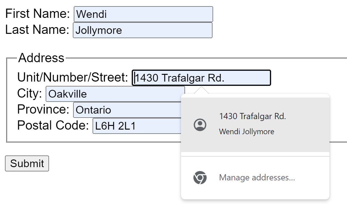
When I click in a form field, the autocomplete option appears.
I can click it to automatically fill all the fields.
Setting Tab Order
A form's tab order refers to the order in which a user will move from field
to field by pressing the tab key. Having a tab order that is logical and
convenient makes it easy to fill out forms with multiple fields. If the
user has to grab the mouse and click on the next field all the time, they
can get annoyed. For example, try and fill in the four fields below:
Filling out these four simple fields is awkward if you are tabbing from one
field to the next, because the tab order is all over the place. To make it
easier for your user to fill out large forms, use the tabindex attribute.
For each control you want included in the tab order, set the tabindex attribute
to a value starting with 1, and counting up. For example, the first field
will have tabindex="1", the second field tabindex="2", etc:
This is really just a review of what we've talked about already
regarding input labels.
When placing input controls on a page, you'll obviously want prompts near each
control so that the user knows that goes in the field. There are specific
ways you must lay out your labels with specific types of input controls,
as defined in WCAG Technique
G162. This technique, which is used to
achieve compliance with
SC 1.3.1 and
SC 3.3.2 (both
of which are discussed
throughout these tutorials) shows how labels should be positioned in relation
to specific types of input controls. For example, for text fields, labels
should either be above the input field or to the left of the input field.
For check boxes and radio buttons, the label should be to the right of
the input field.
Field labels are more accessible to visually
impaired users because they are associated with a particular input field
and therefore better understood by special software, such as a screen reader.
When the user navigates to a field, the screen reader will speak the
text contents of the accessible label.
In addition, a field label can make it easier for users with mobility
issues to use certain controls, such
as radio buttons. When you experiment with field labels, you'll notice
that you can click on the label to put the focus on the input field
associated with that label. This is particularly handy for small controls
like radio buttons and check boxes: many users don't have the fine dexterity
or control needed to get the mouse positioned over the tiny radio button
or check box in order to click it. These small controls are also harder
for users with low vision or similar visual impairments, so having the
extra area to navigate to is helpful.
As you know from earlier examples, a field label is created using the <label> element.
There are a few ways to create and use field labels, but there
are two specific techniques that are preferred. The most important
thing is that the field label is assigned or linked to a specific
input element. You can do this by assigning an element to a field
label using the for attribute
or by nesting the input element inside the label element.
Using the FOR Attribute
The <label> tag has an
attribute for="" that identifies the input field
that this label is associated with. The value of this attribute should be the
id attribute value of the control the label should be paired with (not the name
attribute). The text that is contained in the label goes between the opening
and closing label tags:
If you try clicking on the label of the radio buttons, you'll find that they
act as if you clicked the radio button itself! This effect is caused by using
the id attribute to differentiate between the two controls for the labels.
Similarly, to put your cursor in the name text field, you can click the label text.
Nesting Label and Input Elements
You can achieve the same results by nesting the input
element inside the label. This is the preferred method,
because it allows you easier access to the input element
in a language like JavaScript (which you'll learn in
the second Web course).
This technique involves simply nesting the input element
inside the label element like so:
If you have a situation where you've got an input field
with no accessible <label>, you should use the
aria-label or aria-labelledby
attributes.
aria-label
The aria-label assigns a string to act as
an accessible label or caption for an element that doesn't
already have a <label> or a caption of its own.
For example, in my search form
at the top of this page, the Search button has no text label.
Normally a button wouldn't need a <label> because
buttons have text captions. For example:
<button type="submit">Search</button>
In my case, I used an icon that is easy to understand
for most users. However, if a user was visually impaired, or had
a cognitive disability that resulted in not understanding
the search icon, then my search button becomes inaccessible.
To solve this problem, I coded my button like this:
This way, it's obvious to anyone with assistive technology
that this is a button that would normally say "Search" on it.
aria-labelledby
The aria-labelledby attribute is used to
point an element to another element that already contains
text or a caption. You assign aria-labelledby
the id="" value of the element that contains
the text. This also creates a logical connection between
the two elements, which makes it easier for users with
assistive devices to understand the relationship between
the elements.
Here are a couple of examples of where you might use
aria-label and
aria-labelledby:
If you copy the first example into your own editor and try it
out (you will have to replace the icon or download the one
from the example), you can check it out in the Accessibility
Tree (e.g. in Chrome when inspecting the DOM,
click the icon with the little person on it): Navigate down the
tree to find the Submit button. You can see that it has the
accessible name "Register". This allows a screen reader to
announce the text-less button as "Register" when the user
tabs onto it. Without aria-label, the user would
only hear "button", which doesn't help them determine which
button it is.
If you copy the second example and try it out, open up the
browser's Accessibility Tree and avigate down the tree
to find the Submit button.
You can see that it is linked to
the level-3 heading "Register for Account". This helps a user
with a screen reader
understand that the button is for submitting the form
that asks for credentials so you can register your account.
Note that the first two examples also include the
title attribute. Someone with
cognitive disabilities may not understand the meaning of the icon
used in the button. Adding the title attribute
will show a small toolip when the mouse is hovered over the button,
which can help users not understanding the icon understand the
meaning of the button. Note that not all screen readers will
read out the tooltip text, so you should not rely on the
title attribute to replace aria-label
or aria-labelledby.
If you copy the last example, you'll see that there are
no accessible <label> elements because there are columns
of input fields in a table: the column and row headings serve as the
labels. To make this accessible to screen readers, the aria-labelledby
attribute was used to associate each input field to its column and row heading.
Notice how we put a space between the two IDs e.g.
aria-labelledby="lbl-enroll lbl-mon". If you had only
one value, that's fine, but if you are using multiple values, separate
them with a space.
When a user lands in one of the fields, the screen reader will read
out the column heading and then the row heading so the user knows what
field they're in. For example, when the user's focus lands on the first field
in the 2nd row, the screen reader will say "Enrollment Tuesday".
You don't need to provide too much text for aria-label or
aria-labelledby. This example is a bit too much:
This is a bit excessive:
When the user tabs to the Submit button, the screen reader will say
that it's a button for "Provide Account Information User Name Email
Address. So use these attributes with caution.
Providing Instructions
When you have form input fields with restrictions on the format
and/or range of values that are allowed, you should provide text
instructions to help users avoid input errors. To ensure that
these instructions are easily accessble, use the
aria-describedby attribute.
The aria-describedby is assigned the id="" value
of an element that contains the additional instructions or information.
In the above example, a paragraph contains extra information about
what consititutes a valid department number. How this actually works
for a user with a screen reader depends on the screen reader.
In general, the user who puts the focus on the field should hear,
"edit Enter Department Number Department number must be between 1 and
100 inclusive, or between 250 and 255", although some screen readers
might not read the instructions about the department number's valid values
unless there is an error.
Using Fieldset and Legend Elements
Sometimes it's helpful to visually group your controls
on the page:
Favourite Colour:
Favourite Animals:
The form controls above are displayed using nested DIV
elements, so it looks somewhat
organized, but it can be better.
Fieldsets are containers that can contain a group of related
controls; they aid users with cognitive disabilities by helping them
understand the relationship the inputs have with each other and the
rest of the inputs on the screen. This also helps users with screen
readers when they encounter
groups of controls like radio buttons and check boxes,
by associating the controls together with the text inside the
<legend> element.
To use a fieldset, nest the group of input fields inside the
opening and closing <fieldset<
tags:
The code (which you might notice uses some in-line CSS) for the fieldset above is:
To add an accessible name/label to the fieldset, add the
<legend> tag. This
tag is also used by screen readers, which will associate the text
inside the legend tag in front of each option inside. For
example a screen reader might announce, "Favourite Colour, Blue" and
"Favourite Colour, Green" when the user moves the focus to the Blue
and then Green radio buttons:
You might also have groups of controls or inputs
where the fieldset/legend doesn't really apply. Or perhaps your
controls are already inside a <fieldset> element (it's
bad practice to nest <fieldset> elements). For example: