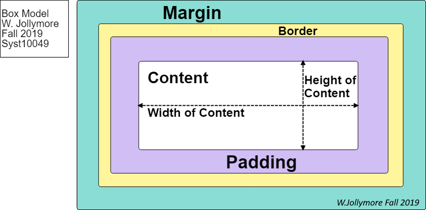
The box model allows you to add borders, margins, and padding
around an element's content.
Margin space is the space around the outside of the border
of the element, and it provides space between elements,
and also between elements and the borders of their container.
Padding space is the space around the inside
of the border of the element: it is the space between
the element's content and the element's inner border.
The box model: the content is surrounded by padding.
Padding is enclosed by a border. Margins represent the spacing
around the outside of the border.
We're going to cover each element of the box model,
starting with borders. Then we'll learn how to add
padding and margins.
After we learn the basics, we'll cover some related topics such as
element width/height, and fun stuff like box shadows.
Borders can be added to elements to make the appearance
more interesting, or to help visually divide areas of
the page. You can configure borders with a specific
width (usually in pixels), colour, and style,
although there are other border properties you might
wish to explore on your own.
Style of Border Line
The border-style property sets the style of
border (the type of line the border has). It can be
assigned one of several pre-defined values:
dotted
dashed
solid
double
groove
ridge
inset
outset
none
hidden
It's important to note that no other border
properties will take effect unless
the border-style property has been set.
The none value can be used when you want
to "turn off" an existing border.
The hidden value hides a border.
The difference between none and
hidden is very subtle - hidden
has a higher priortiy when there is a conflict, so if you're
having issues turning off a border, try hidden if
none isn't working.
The border-style property can take multiple
values if you want to have a different style for each side
of the border. For example:
border-style: solid dashed;
makes the top and bottom borders solid and the left and right
borders dashed;
border-style: solid dashed dotted;
sets the top border solid, bottom border dotted, and the left/right
borders dashed;
border-style: solid dashed dotted double;
will use a different style for all four sides of the border (from
top clockwise around: top right bottom left).
The border-width property defines the
width or thickness of the border line. The
border-width property accepts a
dimension
value; usually this is a
relative
unit, but older stylesheets would use
pixels (px). I also often use pixels in the examples
when I want to exaggerate the thickness of a border
so you can see whatever is being demonstrated.
Note that border-width only accepts a dimension
value, it will not accept percentage (%) units.
Specifying one value sets the width for all four sides.
For example, border-width: .2em; sets all
four sides of the border to 20% of the font
size.
There are also several pre-defined values that define the
border width: thin, medium,
and thick. For example,
border-width: thick; makes
a thicker border.
As with border-style, you can use one, two, three, or
four values to set the different sides of the border.
For example, border-width: .2em .1em;
creates a border that is 20% of the font size
on top/bottom and 10% on the sides.
The border-color property sets the colour of the
border. You can use any
valid colour value.
Additionally, you can use border-colour: transparent;
if you want to use a transparent border (sounds weird, but
it can come in handy if you want the space for a border
but don't want an actual line showing).
As with border-style and border-width, you can specify one,
two, three, or four values to set different colours for
each side of the border.
There are also some properties you can use if you want to set the
border style, width, or colour of just one side of the border individually.
For example, you might have some default settings for borders but want to
change just one side.
You can see an example of why we might use these properies
in the CSS: Border Properties
CodePen.
Experiment with the values, and also note the extra question below
the ".special-div".
You can easily define borders using the single
border shorthand property.
The property takes values for the border's width, the border's
style, and the border's colour. For example:
div {
  border: .2em double darkgreen;
}
The rule above creates a border that is 20% of the
font size, uses the double
border style, and is dark green in colour.
These characteristics are applied to all four sides.
You can also specify only the width and style or only the style
and colour:
The ex-1 rule defines a double border
that's 20% of the font size. By default, the border
will be black. The ex-2 rule defines a dark
green double border. By default, it will be 1 pixel.
A similar shorthand can be used to define border-left, border-right,
border-top, and border-bottom:
The example above styles DIV elements to have a left border that
is .2em, solid, dark green and a bottom border that is
.4em, double-lined, dark green. There will be no top
and right borders.
You can use the border property to define different values for
each side, just as you would with the other properties. Be careful,
as this often makes your border property hard to read!
You can create rounded corners on your borders using the
border-radius property. It's not
supported by all browsers so be aware that it shouldn't be an
important part of your page's appearance.
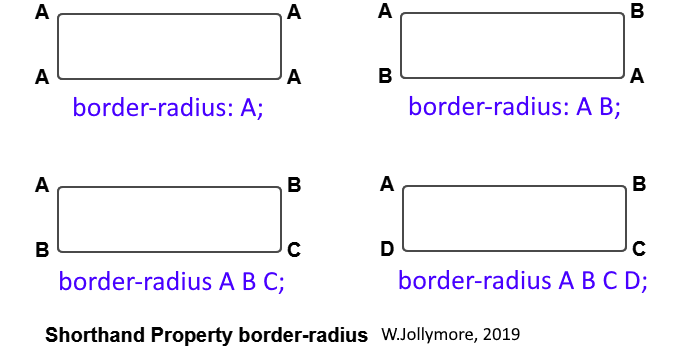
The border-radius takes one, two, three, or four values.
Specifying one value defines the radius of all four corners.
Specifying two values defines the radius of the top-left/bottom-right
corners and the top-right/bottom-left corners. Specifying three
values defines the radius of the top-left, top-right/bottom-left,
and bottom-right corners, respectively. Specifying all four values
defines the radius for the top-left corner, top-right corner, bottom-right
corner, and bottom-left corner, in that order (start at top-left and go
clockwise).
The four versions of the border-radius property
You can also use the individual border-top-left radius,
border-top-right-radius, border-bottom-right-radius, and
border-bottom-left-radius properties.
I like using border-radius to do interesting things.
There's an example in my
CSS: Border Radius CodePen
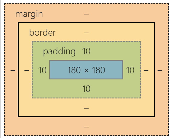
Padding is space inside an element, between the element's content
and the element's border (whether the border has been defined or not).
In the box below, I've set the padding to 10 pixels. Right-click/Inspect
the box and examine the computed styles.
A Box with 10px Padding
You should see an image of the box model when you inspect and view
the computed style of the box:
The box's box model in my browser
You can see that the content area is 180px by 180px (I used absolute
values so that the DIV height and width so that it
would be square, otherwise it would
resize to fit the content). Around the content, you can see that
there is 10px of padding. Around the padding is the border, which
has a width of 0, since I didn't add a border (we'll do that next).
If your content area is shown as 200px by 200px,
don't panic,
it just means that your browser has the box-sizing property
set a certain way, which we'll talk about later.
When you specify padding, you have several options:
Setting each padding property separately: padding-top,
padding-bottom, padding-left, and
padding-right.
Each property sets the padding on one side, e.g.
padding-right sets the padding only on the right side.
You wouldn't normally use all four at once: You usually use one or
two of these properties to change the padding on one or two sides.
Each property takes a single unit of measurement. Usually in
a relative
unit, but you can use any valid
dimension
that's a size measurement (e.g px, em/rem, %, etc).
Example: Try the CodePen CSS:
Padding Example 1. Try changing
the different padding values. Try changing some to %,
try also using px.
The shorthand padding property
allows you to set all four padding values at once.
For example, padding: 5px 7px 9px 12px;
The first value defines padding-top, the
second value defines padding-right, the third value defines
padding-bottom, and the last value defines padding-left (start
at the top and go around clockwise).
You can also specify three values, to set the top, right/left, and bottom.
For example, padding: 5px 10px 12px;
defines top padding of 5px, bottom padding of 12px, and both the
left and right padding at 10px.
Specifying 2 values defines the padding for top/bottom and the padding
for left right. For example,
padding: .25em .5em; defines top and bottom
padding of .25 times the font size and left/right
padding of .5 times the font size.
Specifying one value defines the padding for all four sides. For
example, padding: .5em; defines padding
of half the font size on all four sides -
top/bottom/left/right.
We can combine the individual properties and shorthand properties to
make our code smaller and more efficient. For example, you might have
some padding set for all DIVs in a document and define certain DIVs to
have different padding on the left. You can see an example of this
at this CodePen: CSS Padding
Example 2.
Where padding defines the space inside an element,
between its content and the border, margins define the space
around the outside of an element. In other
words, margins are the spaces outside of
the element's border and provides some space between elements
on the page.
Margin properties work exactly like padding properties. You
have the individual properties and the shorthand property, and they
work in the exact same way:
margin-top: the top margin
margin-bottom: the bottom margin
margin-left: the left margin
margin-right: the right margin
margin: shorthand property for all four margins.
It can take one, two, three, or four values.
You can use the auto
value to horizontally center an element. For example:
div {
  margin: .3em auto .5em;
  width: 75%;
}
The div rule above will add a top margin that is 30% of the
font size, a bottom margin that is 50% of the font size,
and will automatically distribute the left
and right margin such that the div is centred on the page.
The width property was added to make the div smaller than
the viewport width: if the width was set to its default of 100%,
then using "auto" for the left/right margin wouldn't work. Note
also that this centers the div container on the page, it does
not center its text. For that, you would need to use
text-align.
I've made some simple examples using margin properties
in the CSS: Margin Properties
CodePen.
Feel free to play with the margin values.
You might have noticed during the lesson that sometimes
an element's height and width depends on the box model:
the size of an element might include it's padding, margins,
and border width. It's important to be able to calculate
the width and height of an element properly, and also
how you can have a bit of control over an element's box size.
Setting Element Width and Height
You often will want to specify the width and height of an element.
This can be done using
relative units
or absolute units
Use relative units for scalable and responsive design; use
absolute units when you need a specific size (e.g.
for an image).
You can also use the value auto for height
and width. This value indicates that you want the browser
to calculate the height and width.
Note that if the height and width of your element doesn't
fit the element's content,
you could end up with some undesirable results. See
CSS: Height and Width for a
demonstration of how the height
and width works with pixel measurements. You can have some control over
how the content is dealt with using the
overflow
property.
Note also that when you right-click/Inspect the box and view
the computed style, the size of the margin, padding, and
border are added to the 200px width and height. That means
the total width of the box is 10px (left margin) + 1px
(left border) + 5px (left padding) + 200px (content) + 10px
(right padding) + 1px (right border) + 5px (right margin)
= 232px. You can do a similar calculation for the total
height.
Calculating Height and Width of Elements
By default, an element's height and width does include
the height and width of its content, as well as the
thickness of any margins, padding, and borders the
element has.
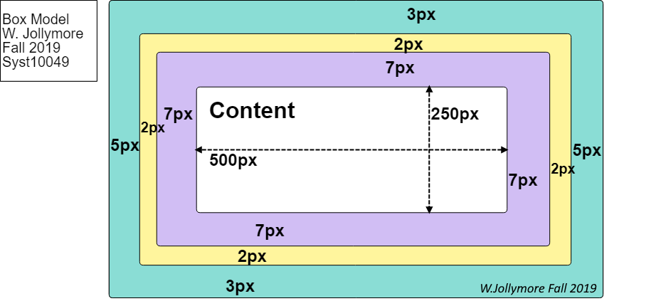
For example, let's say you have a div with the following
CSS rule:
Let's say the content of the DIV element is some text
that takes up 500 pixels of width and 250 pixels of height.
What would be the total size of the element on the page?
First, let's calculate the width: You would have to
take the width of the content and add the width of the border,
plus any margin and padding. So for our example, would
it be correct to say that the width of the element is
500 + 2 (the border) + 5 (the margin) + 7 (the padding)?
No!
The width includes the width of borders, margin, and padding
on both sides. The height includes the height of borders,
margin, and padding on both top and bottom.
The border goes all around the element, so you have border
space on both the left and right sides. You also have padding
on both the left and right sides, and margin space on both
the left and right sides. Therefore, you have to make sure
you add 2 x the border width, the left padding, right padding,
left margin, and right margin. Therefore, we would calculate
the total width as:
What would be the total width and height of a DIV
element that contains an IMG element, where the image
is 300 x 300 pixels?
The box-sizing Property
The box-sizing property
defines how the total width and total height of an element's
box area is calculated. It can receive one of the following
values:
content-box -
(default value) if a CSS rule assigns a specific height
and width to an element, the
content area will be sized to fit.
The style rule above declares that a DIV elements size
will be calculated as the defined width/height plus
any border, margin or padding space. For example, the
element's width will be 150 + 2 + 2 + 5 + 5 = 164 px
and the element's height will be 200 + 2 + 2 + 5 + 5
= 214px.
If you use % values for width/height, this can cause
problems: e.g. if you have 2 elements set to 50% width each,
they won't fit on the screen if they both have borders, margins,
and padding greater than 0.
border-box - this states that
if a style rule includes border/margins/padding, those values should
be included in the specified height and width.
If we changed the previous example to:
Then we'd have to change our calculations as follows:
The total width of the element is 150px - no calculation
needed there, because it clearly says width: 150px;.
However, what is the width of the content area?
The content area width would be calculated as
150 - 2 - 2 - 5 - 5 = 136px because
we have to subtract the left/right margin and left/right padding
(and the left/right border, if there was one)
to find out the width of the content area.
Similarly, the total height is 200px as stated.
However, the content
area's height would total height minus top/bottom
border/margin/padding, so our example's content height
would be 200 - 2 - 2 - 5 - 5 = 186px
We often use the border-box property to make
sure a series of elements are the same width when they might
have borders/margins/padding of different sizes. Examine the
CodePen below: Notice that the divs are all different widths because
they have different border widths and different amounts of padding.
Uncomment the declaration in the rule that styles all the divs to
set the box-sizing property to border-box.
Notice that all the divs are now the same size.
Box Shadows
Box shadow is used to create "cards", which is currently a
trend in web design.
To define a box shadow, you need to use the box-shadow
property. You need to specify at minimum, 2 things:
The horizontal offset of the shadow. This is a required value.
Usually it's specified in pixels. Positive values move the shadow to the right
and negative values move the shadow to the left.
The vertical offset of the shadow. This is a required value.
Usually it's specified in pixels. Positive values move the shadow down
and negative values move the shadow up.
To understand the horizontal and vertical offset, imagine the shadow
already exists directly behind the element so that you can't see it.
If you offset it by a certain number of pixels, it's like sliding the
shadow to the sides or up/down so that the edges of it are visible.
Try this CodePen example CSS: Box Shadow
1.
Try changing the values of the shadow's horizontal and vertical position.
Try using negative values, too.
Right now the shadow is pretty sharp. You can add a third value to specify
the amount of fuzziness (or blur) to your shadow. This is also usually set
in pixels; it defines how much of the shadow you want to blur, starting from
the outer edges of the shadow and going towards the middle of the element.
Try this CodePen example CSS: Box Shadow
2 to
see how blur works. Play around with the values!
A fourth value can be used to specify the spread of the shadow. The
shadow spread defines how much the shadow should expand (imagine smudging it
with your finger to make it larger).
Try this CodePen example CSS: Box Shadow
3 to
see how shadow spread works. Play around with the values!
Are you tired of this plain black border? You can add a 5th value to
change the colour of your shadow. I've added one to
CSS: Box Shadow 4 so you can try it
out.