In this lesson we'll discuss an overview of Responsive Design and
the different techniques that have been developed over the years:
how did responsive design get to the stage it's at now? What
does "responsive design" even mean? We'll also talk about that
viewport <meta> tag you're always adding to
your HTML documents - you'll find out exactly what it does and what
all the parts of it mean!
What is Responsive Design?
Responsive Design is a design technique
for applications and web content that focuses on how user interfaces automatically
adapt to changes in the user's screen or device size, orientation, resolution,
font sizes, and several other factors. Examples of responsive design could include:
A web page's images shrink to fit when you view the page on your
phone.
An application's form layout shows as a single column on a narrow device
screen like a phone, and shows as several rows and columns on a wider
device screen like a desktop monitor. The page also makes a similar adjustment
if you view it on a phone in portrait mode vs landscape mode.
The repetitive menus at the end of each article on these tutorial
pages don't appear when you try to print a hard-copy of a page
because they're not needed.
The topic menu on each of these pages appears as a clickable button on the
top-left of the screen that you can show/hide, unless you're on a much
wider screen, in which case it appears along the left side of the page.
It's important to ensure that your web pages and applications
are responsive. A responsive page/app visually adapts
to a user's device and device settings. For example, if a user
is using a small screen (such as a smart phone), or a user has
their font DPI set to a higher value than is typical (e.g. 200%),
or a user has resized their browser to fit half their
monitor so they can use another application on the other half of the
screen (a.k.a split screen).
A responsive page/application should adapt to such changes and
still be usable to users on all devices or with any device
settings.
When we look at responsive (or lack of) design, we can think
of four different categories or levels:
Fixed
Fixed design uses absolute
widths (e.g. using px, pt, cm, or other absolute
measurements).
Resizing the screen, enlarging the fonts, or
viewing on a different device doesn't change
the way the interface appears.
Fluid
Fluid design uses percentages
and ems for widths.
Items are sized relative to one another
and the viewport, so items are scaled when the screen is resized,
or a different device is used.
Adaptive
Adaptive designs uses
media queries to change the page's layout when a certain
screen size is detected.
For example, a media query can
dictate that a mobile.css file is used for mobile devices
and a main.css file is used for desktops and laptops.
Different styling rules are applied to items based on the
media query's criteria. For example, you could state that items resize
to a certain percentage on a small screen and then state that
those same items should stretch to the entire width on
a large screen.
Responsive
Responsive design
uses both media queries and fluid grids (e.g.
FlexBox, CSS Grid) to dictate how items resize/reposition
themselves as the screen/font size or devices change.
Mobile-First development is the new
standard, and items adjust/adapt when a larger screen
is detected.
I've created some
examples of fixed, fluid, and adaptive design
so you can compare. Each page contains a link to its CSS file so you
can view the code. Test each one by resizing the browser window to
simulate different devices (phone, tablet, small monitor, large monitor,
orientation, etc).
Notice how the layout behaves as you resize, notice what happens to
the different parts of the content. What works well and what doesn't?
Quick and easy access to each part of the examples (I've left some
comments and other information inside the code and in the contents of
each page, so make sure you read them all):
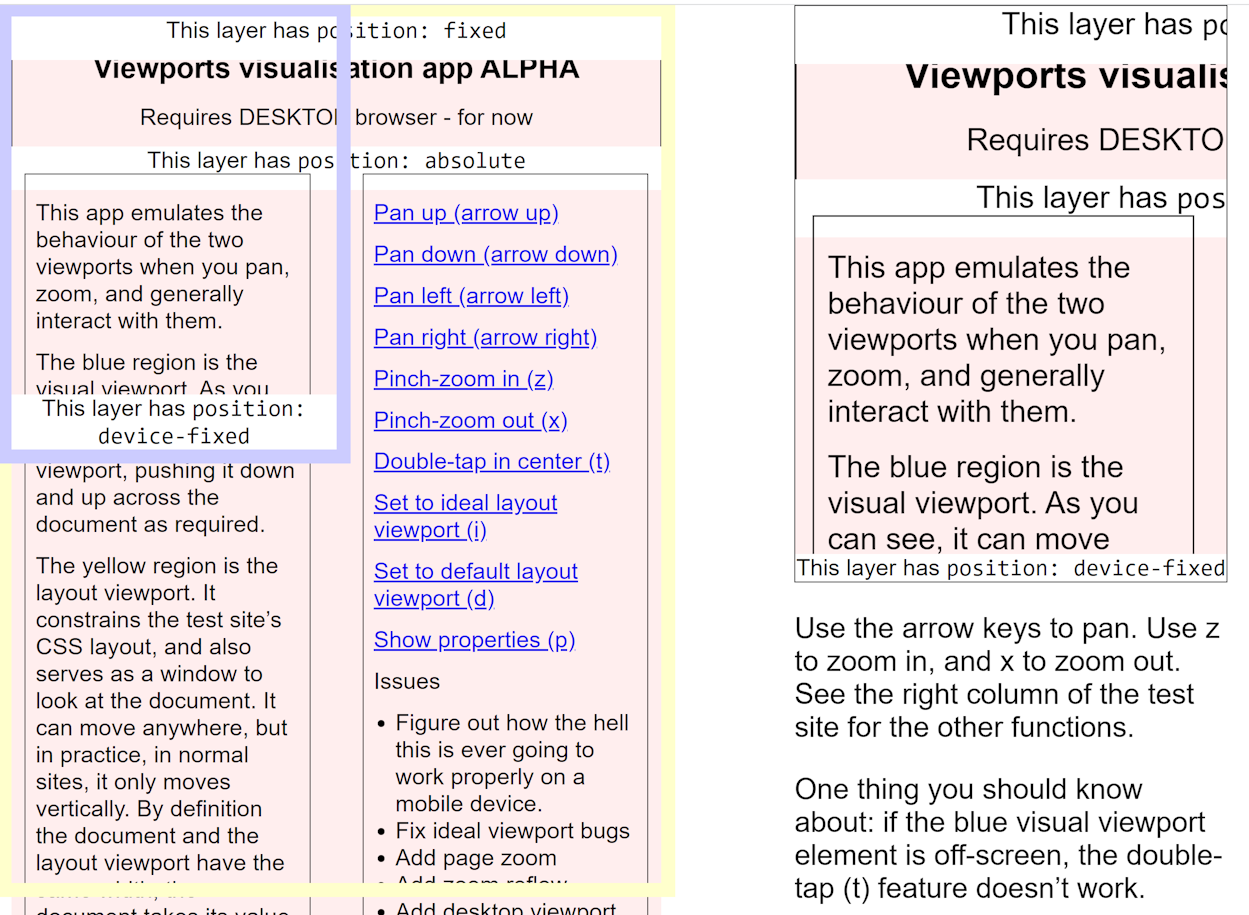
The viewport is actually a complicated part of the browser.
There is what developers refer to as the layout viewport
and the visible viewport. The
layout viewport is the
actual page that you're viewing, and the
visible viewport is the
visible part of that page through your device's screen.
Try to imagine that the visible viewport
is a window or frame that you're looking through when you look at
the layout viewport (the page). This web page provides an excellent
visualization of the layout viewport and visible viewport:
The Viewports Visualization App: must use
a desktop browser to try it.
The larger, yellow box is the layout viewport. Usually, a web page
will adjust its width to fit the layout viewport, and the user
can scroll vertically to view the rest of the document.
If the page contains an object (such as an image) that is wider than
the layout viewport, the layout viewport will not fit and the
user will have to scroll horizontally. But other than that,
horizontal scrolling is not available because a document is
always resized to fit the width of the layout viewport.
The smaller, purple/blue box that moves (use the arrow
keys - there's instructions
in the left column) is the visual viewport.
As a user scrolls, the visual viewport moves around. When
browsing a site on a small device, the visible viewport is
the same size as your device screen (in fact, you can think of the
visible viewport as the actual device screen).
By default, the layout viewport is resized to fit the
visible viewport. In other words, a web page is zoomed out
so that it's entire width fits on your device screen.
This is why you don't really notice
a visible viewport on your laptop or desktop: the visible
and layout viewports are the same size as your
screen and/or browser window, and those windows are
large on a large screen. This becomes a problem
on mobile devices, where the viewport has a much smaller
area to work with:
A web page on a mobile device simulator.
Note that this effect can vary on different devices.
For example, Android devices will always make the layout
viewport as wide as the widest element.
On a small device, the layout viewport width is larger than
the device screen width. How large depends on the device,
usually they're between 800px and 980px. This means that
a user always has to scroll horizontally to view
most web pages.
Additionally, if you're using percentage widths on your
page elements, things get unreadable. A sidebar that takes up
15% of the page on a large screen looks fine, but on a small
device that's only 480 pixels wide, that sidebar takes up
only 72 pixels, which is very narrow (that's about half the width
of a slim finger). Note that percentage widths are
always relative to the layout viewport.
In the old days, we would make 2 versions of the more
important pages on a site: one for desktops/laptops and one
for mobile devices. You could imagine how cumbersome this was:
updates to a page required twice the work.
To fix this, the viewport META tag was introduced for
small devices. The viewport META tag is not technically official
HTML but it is supported by several mobile browsers. It allows
a developer to configure:
The default width of the page.
width=device-width indicates
that the page's (or layout viewport's) width should
default to the width of the device. The height will adjust
automatically.
The zoom level of the page.
initial-scale=1.0 indicates
that the page should load with a normal zoom level. The value
indicates the ratio of device pixels to CSS pixels.
The viewport META tag has no effect at all in browsers on
desktops and laptops. It only works for small devices.
Without the viewport META tag, a browser will show a page with
it's layout viewport and visible viewport as the same size, causing
a web page to fit its width and then zoom out so that its all visible.
On some pages, this makes the text very difficult, if not impossible,
to read. It forces the user to zoom in, and then they are required
to scroll horizontally in order to read the content.
Remember that some mobile browsers, particularly those on Android
devices, will resize any content containers so that the content
fits perfectly on the device screen, but this isn't true of all
mobile browsers.
Using the viewport META tag allows you to change the size of the
layout viewport to the same size as the device screen. You can also
adjust the default zoom factor to ensure that the device doesn't zoom
out to fit everything.
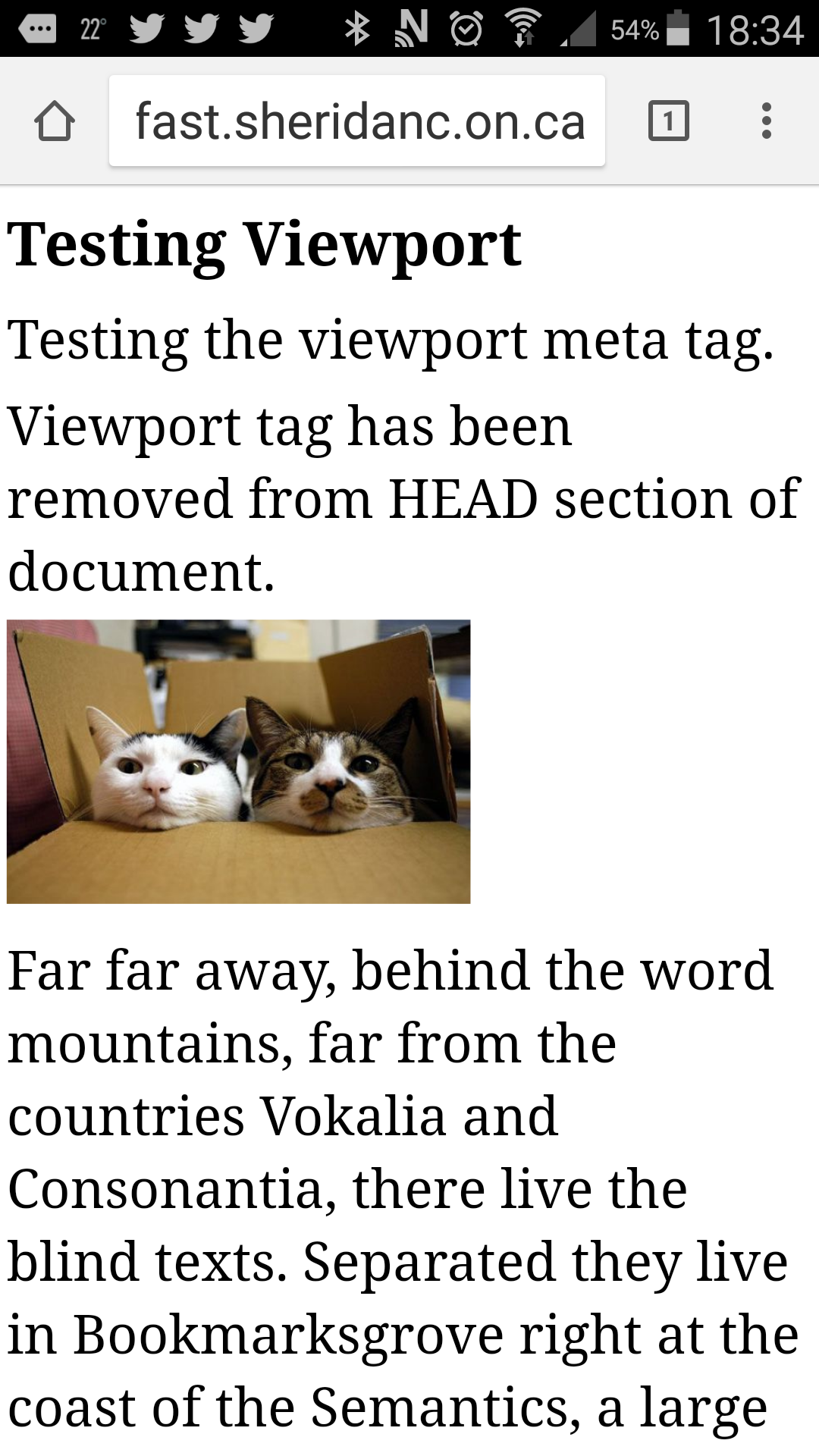
I created a
simple
web site that you can test (https://tinyurl.com/wsjTestVP)
on your own small
devices (note that there is really nothing interesting to see
if you test this on a laptop or desktop screen). If
you need to, just enter the tiny URL in the brackets
into your mobile browser.
The main page shows you your device's screen width and
visible viewport width. The viewing area and viewport size
are measured in CSS pixels. When you measure
anything in CSS using the "px" measurement, you're measuring
in CSS pixels. A device screen's width and height are also measured
in pixels, but those are "device pixels".
To understand the difference, say you have an image that is
styled to have a width and height of 100 pixels (that's
CSS pixels). On a screen with a zoom factor of 1.0 (normal zoom),
then the image is also 100 device pixels. When the user
zooms in (say, zoom factor 2.0) the image takes up more of the
screen than before: it appears larger. The image is still 100
pixels in size, but now it's taking up 200 device pixels in size.
Similarly, if you zoom out on the image - for example, zoom factor
0.5 - the image appears smaller, and it takes up only 50 device
pixels on the screen, even though it's still technically 100
CSS pixels in size.
So in summary, when the zoom factor is normal (1.0), 1 CSS pixel
= 1 device pixel. When the user zooms in,
a CSS pixel takes up more than one device pixel
(e.g. with a zoom factor of 2.0, 1 CSS
pixel = 2 device pixels). When the user zooms out, you can fit more CSS
pixels into 1 device pixel (e.g with a zoom factor of
0.5, 2 CSS pixels = 1 device pixel).
Once you've examined the main page, try the various links
to see the effect of different viewport options.
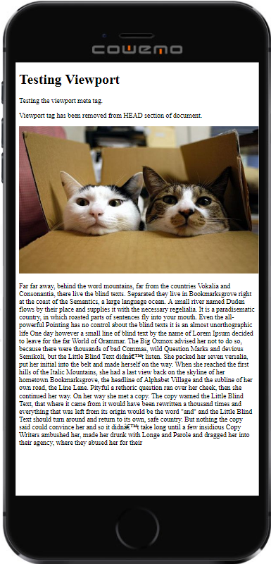
Here are some screen shots of the example pages on my own
Android phone (note that Android browsers tend to be a bit more
flexible when it comes to the layout and visible viewport, so
mine are probably a bit different than some other phones might show).
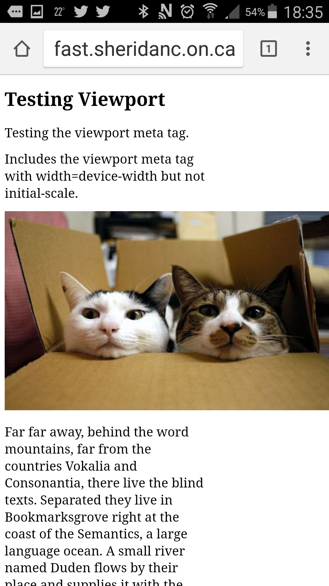
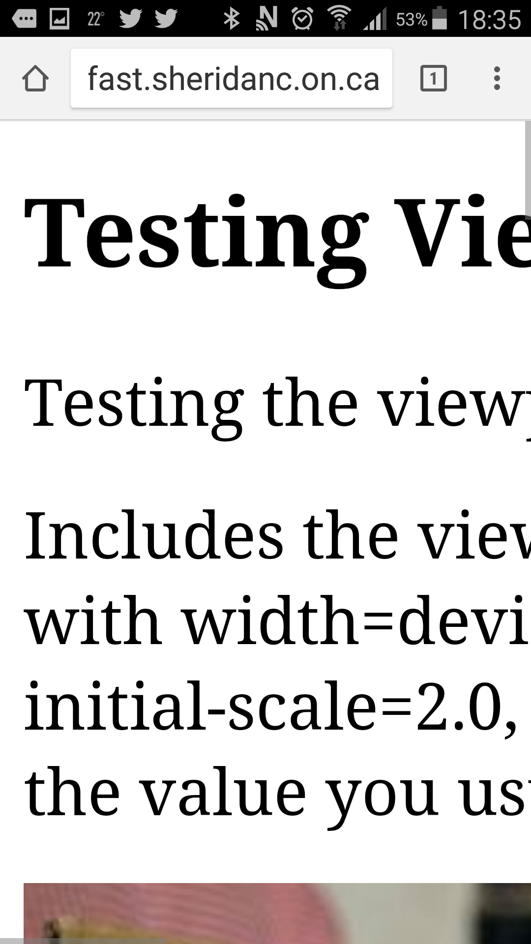
1. The page with no viewport META tag (my Android
phone has a large font setting, which it tries to respect
when possible). 2. The page with a viewport META tag setting width=device
width, but not initial-scale. On my Android phone, the layout
viewport resizes to fit the large image. 3. The page with the complete viewport META tag
(initial-scale is 1.0).
On my Android phone, the image is cut off because the image
is 555 pixels wide, and my phone's viewport is only 412 pixels
wide. 1. The page with the initial-scale set to 2.0.
You should be able to understand at this point why the viewport meta tag
is so important for responsive web design. You should use it
in each of your HTML documents.
Practice Quiz
Try this quiz to see how well you remember what you've
been learning.
Read the question and choose an answer.
Click the Check Answer button to check
your answer.
If the answer is wrong, you can try a different answer.
Answers you've already selected are highlighted.
Once you find the correct answer, or if you just want to move on,
click the Next button.
After the last question, you can start the quiz over if you want.
The questions and answers are randomized, so that you are encouraged
to use your critical thinking skills.
Viewport Units
A new unit of measurement was added to CSS3: viewport
units. There are several units you can use to set the
height/width of items or the placement of
items on the screen:
Standard viewport units are the original
viewport units, and measure in relation to the height
and width of the viewport.
In the CSS Values and Units Module Level 4, three modifiers
were added to the standard viewport units to add even
more flexibility for mobile phone browsers: You've
probably noticed that when you're using a browser on your
phone or tablet, you can show/hide the menu bar, address
bar, bottom status bar,
and other user interface components when you scroll
up and down the page. The small
viewport is the one you see when the browser's
user interface components are showing. The
large viewport shows
when the browser's user interface compnents are
hidden (e.g. when you scroll).
Two modifiers were added to allow you to size things
relative to the small viewport (s modifier)
and the large viewport (l, lower-case L,
modifier). A third modifier allows you to use the "dynamic
viewport" (d modifier),
which are units that will adjust as various user interface
elements (such as the address bar) appear and
disappear.
The Small and Large Viewport
Dynamic viewport units are the most versatile: when
the browser's UI components are visible, dynamic units
are the same as small viewport units. For example,
1dvw will be the same as 1svw.
When the browser's UI
components are not visible, dyanmic units are the
same as large viewport units. For example, 1dvw will
be the same as 1lvw. For the brief moment when the UI
is scaling as the UI components show or hide, the dynamic
viewport units will scale, although this is also very
resource heavy as the screen has to redraw itself.
Unfortunately, at the time this tutorial was last updated,
the modified viewport units (s, l, and d) were not widely
supported in many browsers. You should be careful
when using them and use standard viewport units or ems/rems
as a fallback. Make sure you check the latest information
for all the different viewport units on
CanIUse.com - viewport units (opens
in the
ref tab).
Here's a table that summarizes the different viewport
units:
Viewport Units
Unit
Description
Standard Viewport Units
vw
viewport width
1vw = 1% of the viewport's width
100vw = 100% of the viewport's width, or the full width
vh
viewport height
1vh = 1% of the viewport's height
100vh = 100% of the viewport's height, or the full height
vmin
viewport minimum
represents the smaller value out of vw and vh
e.g. if the screen was 480px wide and 800px high,
100vmin would be 480px and 1vmin would be 4.8px
vmax
viewport maximum
represents the larger value out of vw and vh
e.g. if the screen was 480px wide and 800px high,
100vmax would be 800px and 1vmax would be 8px
vi
viewport inline
the inline axis: for horizontal writing/layout,
this would be the width; for vertical
writing/layout, this would be the height
vb
viewport block
the block axis: for horizontal writing/layout,
this would be the height; for vertical
writing/layout, this would be the width
Small Viewport Units
svw
small viewport width
1svw = 1% of the small viewport's width
100svw = 100% of the small viewport's width,
or the full width
svh
small viewport height
1svh = 1% of the small viewport's height
100svh = 100% of the small viewport's height,
or the full height
svmin
small viewport minimum
represents the smaller value out of svw and svh
e.g. if the screen was 480px wide and 768px high
when the browser's UI elements were showing,
100svmin would be 480px and 1svmin would be 4.8px
svmax
small viewport maximum
represents the larger value out of svw and svh
e.g. if the screen was 480px wide and 768px high
when the browser's UI elements were showing,
100svmax would be 768px and 1svmax would be 7.7px
svi
small viewport inline
the inline axis when the browser's UI
elements are showing: for horizontal writing/layout,
this would be the width; for vertical
writing/layout, this would be the height
svb
small viewport block
the block axis when the browser's UI
elements are showing: for horizontal writing/layout,
this would be the height; for vertical
writing/layout, this would be the width
Large Viewport Units
lvw
large viewport width
1lvw = 1% of the large viewport's width
100lvw = 100% of the large viewport's width,
or the full width
lvh
large viewport height
1lvh = 1% of the large viewport's height
100lvh = 100% of the large viewport's height,
or the full height
lvmin
large viewport minimum
represents the smaller value out of lvw and lvh
e.g. if the screen was 480px wide and 800px high
when the browser's UI elements were not visible,
100lvmin would be 480px and 1lvmin would be 4.8px
lvmax
large viewport maximum
represents the larger value out of lvw and lvh
e.g. if the screen was 480px wide and 800px high
when the browser's UI elements were not visible,
100lvmax would be 800px and 1lvmax would be 8px
lvi
large viewport inline
the inline axis when the browser's UI
elements are not visible: for horizontal writing/layout,
this would be the width; for vertical
writing/layout, this would be the height
lvb
large viewport block
the block axis when the browser's UI
elements are not visible: for horizontal writing/layout,
this would be the height; for vertical
writing/layout, this would be the width
Dynamic Viewport Units
dvw
dynamic viewport width
equal to svw if the UI elements are visible,
equal to lvw if they are not visible
1dvw = 1% of the viewport's width
100dvw = 100% of the viewport's width,
or the full width
dvh
dynamic viewport height
equal to svh if the UI elements are visible,
equal to lvh if they are not visible
1dvh = 1% of the viewport's height
100dvh = 100% of the viewport's width,
or the full width
dvmin
dynamic viewport minimum
represents the smaller value out of dvw and dvh
dvmax
dynamic viewport maximum
represents the larger value out of dvw and dvh
dvi
dynamic viewport inline
the dynamic inline axis
dvb
dynamic viewport block
the dynamic block axis
Here's a demonstration of the different viewport
units you can try in your mobile device:
https://tinyurl.com/wsjTestVPU.
Note that you need to use your mobile device's browser, and
also note that not all parts of the demo will work if your
mobile browser doesn't support all of the newer viewport
units (try different browsers on your device!)
Responsive Images
Images are a huge part of many sites, so it's worth taking some
time to discuss images.
To make an image responsive to viewport changes, simply set
it's width to 100%. This will cause the image to always fully fit
its container. You don't need to set the height: it will adjust
automatically, but you can set it to auto, if you prefer.
Try this example in your own editor/browser with any image
you like (make sure your image is at least 500 pixels
wide, you could use the
cat-friends.png image if you wish, but please download it to
your own computer/server, do not hotlink to my image files). Copy the code from
this CodePen and try the following
things:
Put your image path in the src attribute of the IMG
element and then load the page as is, without changing
any of the CSS.
Notice that the image doesn't fit inside the DIV element.
Let's make it fit!
Go to the CSS and add the width: 100% declaration to the
img rule. Now save the CSS file and refresh the page
in your browser. Notice that the image now fits inside
the DIV.
Now try it without the DIV: Delete the DIV element
(delete both the opening tag and closing tag). Now the
image's parent container is the body element, so now its
width will be 100% of the page body.
Save and reload the page. Resize the browser window
and/or test the page on your phone if you've uploaded it
to the development server.
Notice that the image is able to grow to a size larger
than its original size.
When the image's parent container was the BODY element, we
were able to stretch the image as large as our browser window
allowed. It's possible the image might also be too big for your
phone, regardless. Similarly, you can shrink the image as much
as your browser window allows. It might even be possible to
shrink an image so much that it's hard to see, or doesn't look
as nice.
Fortunately we can fix both of those issues with the max-width
and min-width properties. These define the minimum and maximum
width of the image (height will always be calculated automatically,
keeping with the image's aspect ratio).
Edit your CSS file by adding a max-width of 600px and a
min-width of 250px. Note that we normally discourage the use of
absolute measurements, but it's ok in this case. Because we're
using a percent value for the width, it will adjust as needed,
and we're using absolute measures for the minimum and maximum width
to ensure the image doesn't go above and beyond a certain size.
Layout and Accessibility
The layout of your web pages can have a huge effect
on the accessibility of your site. We often think
of responsive design as something we do so that our
sites work well on larger desktop browsers and also
smaller mobile phones in either portrait or landscape
orientation. However, responsive design also promotes
accessibility, when it's done effectively.
For example, a user might we in a wheelchair or other
device with a tablet clamped onto the arm of the chair.
In some cases, the orientation of the tablet is fixed
- the user is unable to change the orientation. Your
web site should meet the 4 WCAG guidelines (Perceivable,
Operable, Understandable, Robust), even if the user is
on a tablet in a fixed orientation.
Another example: often responsive layouts result in a
change in the order of the content. In the earlier demonstration,
some of the page elements changed location when the page
changed from a wider screen with multi-column layout, to
a smaller screen with a single-column layout. When
this occurs, it's important to make sure that content is
still presented in a logical way that doesn't affect how the
user perceives and understands the content, or the relationship
between segments of content.
Reflowing Content
Reflow refers to the behaviour of
content when the viewport is resized: does text word-wrap so that
all text is still visible in the viewport without having to scroll
horizontally? When the user zooms in to view content, does the content
reflow or stay static, so that only a portion of the content is visible?
Reflowing content IS responsive web design! For example,
when a user has smaller fonts and/or a wider screen, content can be reflowed
so that it displays in more than one column. When the user uses the browser
zoom, enlarges the font size, and/or uses a narrower screen, content
in multiple columns should reflow into a single column.
WCAG Success Criteria
1.4.10 Reflow states that
content can be enlarged without requiring horizontal scrolling.
This SC emphasizes how tracking (being
able to follow the lines of text, the ability to easily read to the
end of a line of text and find the beginning of the next line of text)
is vital to perceivability and comprehension: when users are forced
to scroll horizontally to track lines of text, reading and understanding
the content is much more difficult and requires more time and effort.
WCAG Success
Criteria 1.3.2 Meaningful Sequence
says that reading order of content should be preserved when the layout
of the page changes. Content that does not meet this success critera
can be confusing for users with cognitive disabilities, but can also be
harder to understand if the user is using a screen reader.
Additionally, WCAG
Success Criteria 2.4.1 Bypass Blocks discusses the need
to provide a mechanism for users with screen readers to easily
skip over repeated content such as headers, menus, advertisements, etc.
Sighted users can ignore this content easily, but a user of a screen
reader is forced to hear the same content every time they
visit a new page on the same site. Similarly, users that navigate
with the keyboard don't have to repeatedly navigate through all the
repeated elements.
There are several techniques listed, including:
